west 30th place
This mid-century home in Golden had graceful bones, but decades of well-intentioned remodels had left her disjointed. Layers of architectural clutter had piled up over the years until the original character of the house was hard to see through them. Our work was to peel those layers back and return the home to a state of simple elegance, with a design language true to the architecture that had been there all along. The rhythm of the original ceiling beams became our unit of measurement throughout the whole project, and we let that rhythm dictate everything from the placement of the new powder bath to the proportions of the kitchen island. The architecture steals the show at every turn now, the way it was always meant to.
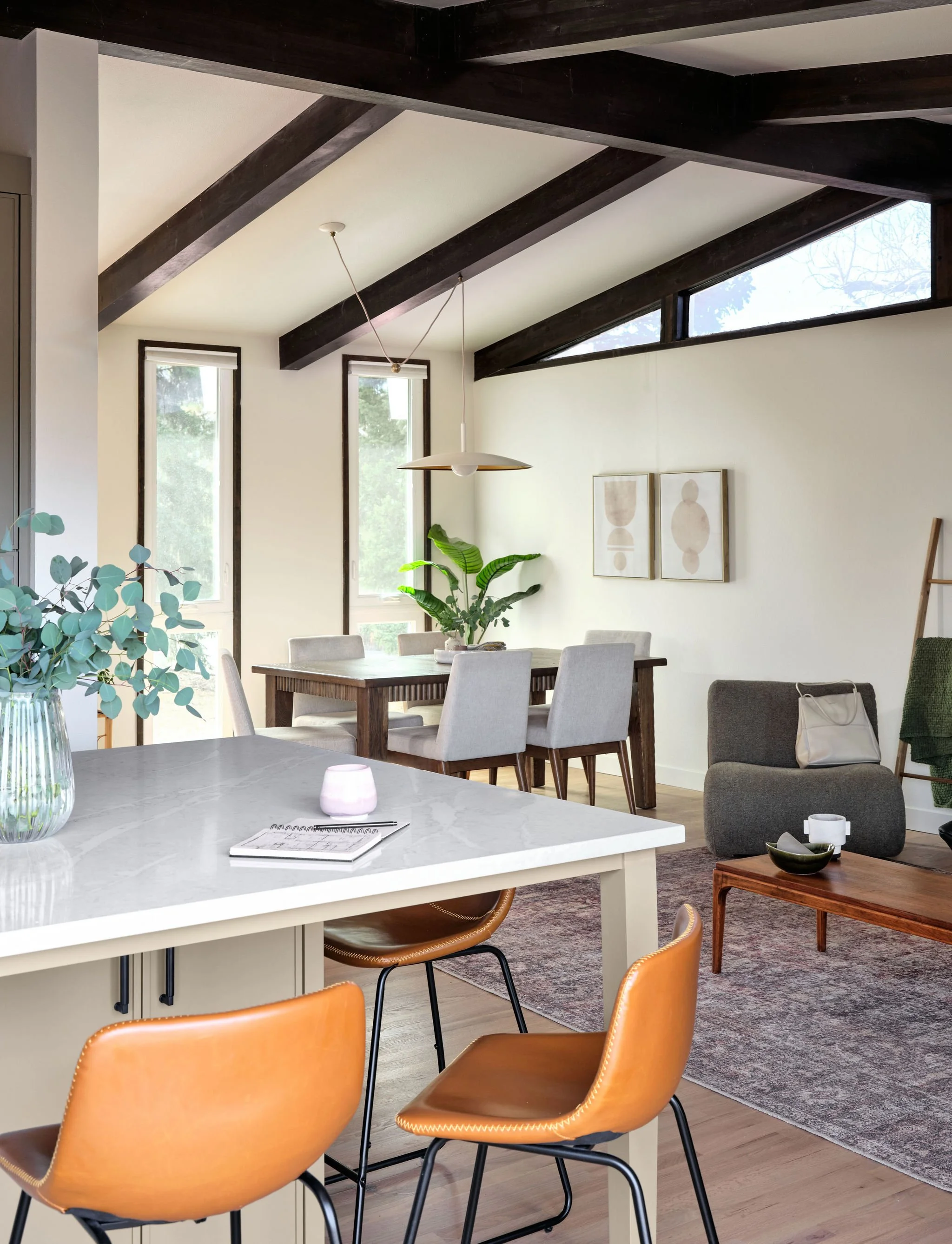
the kitchen
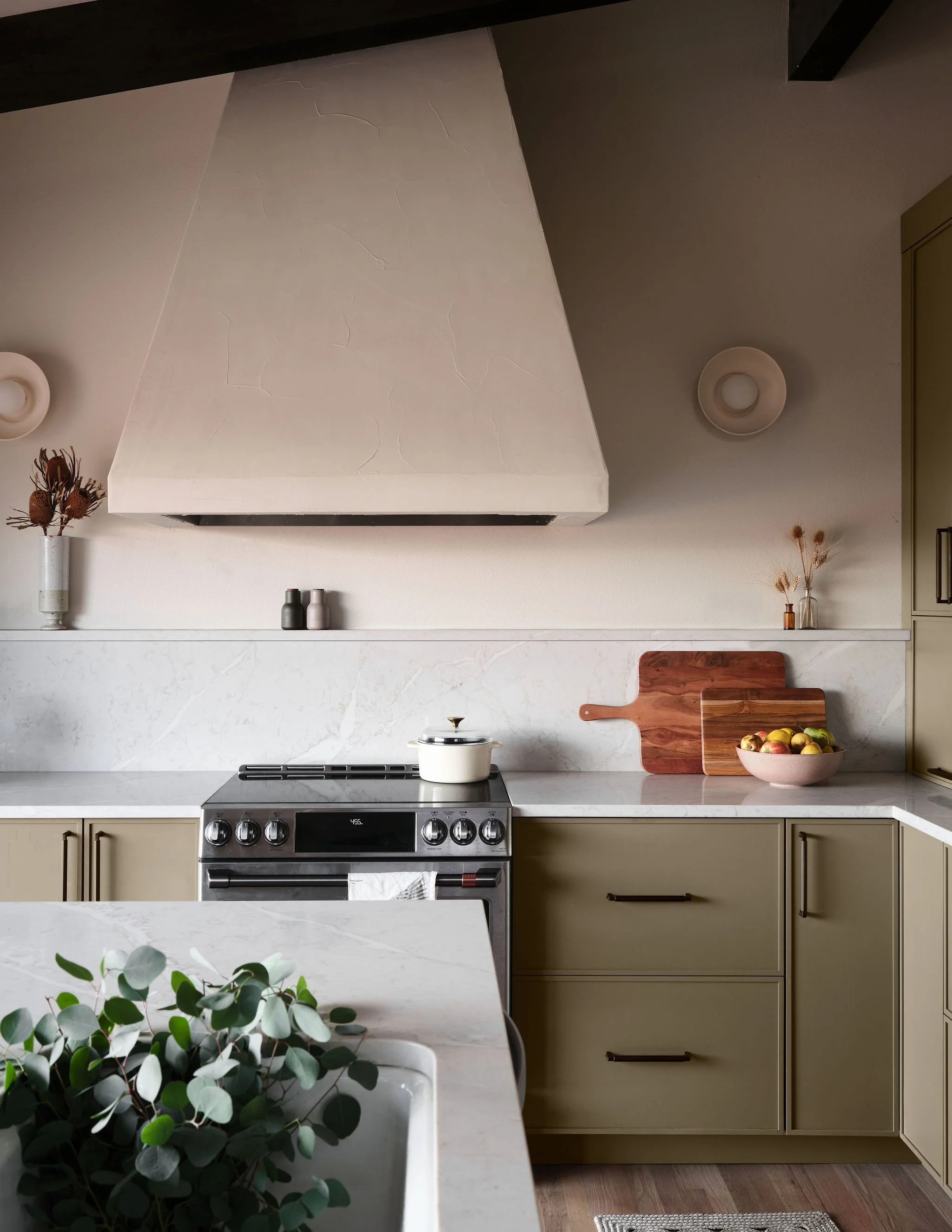
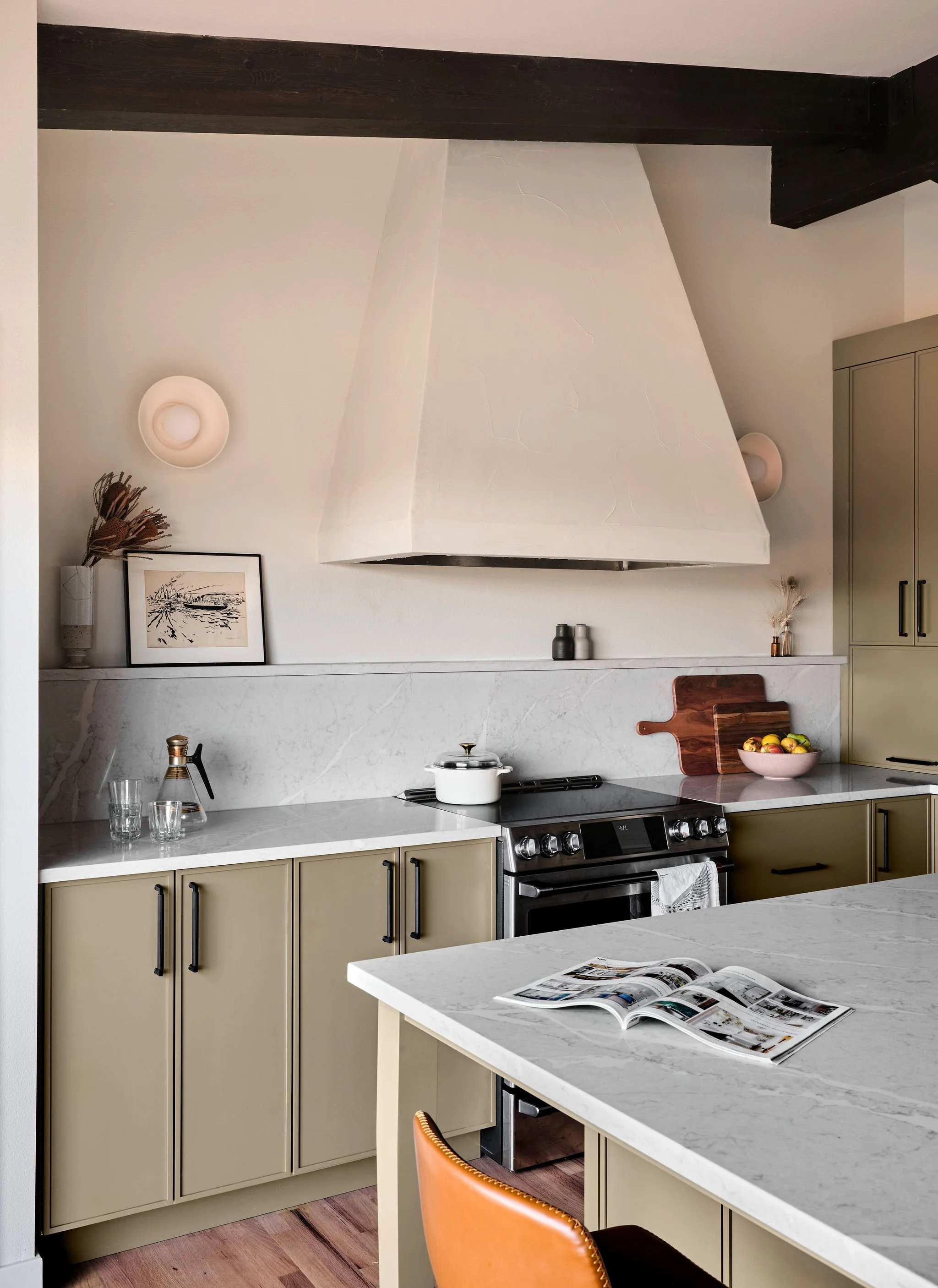
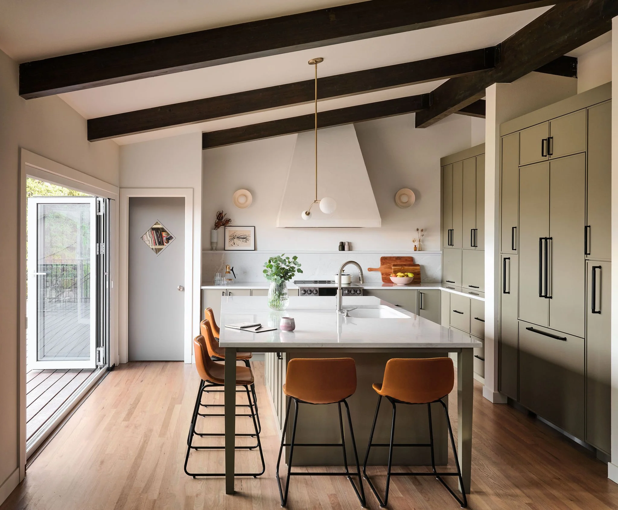
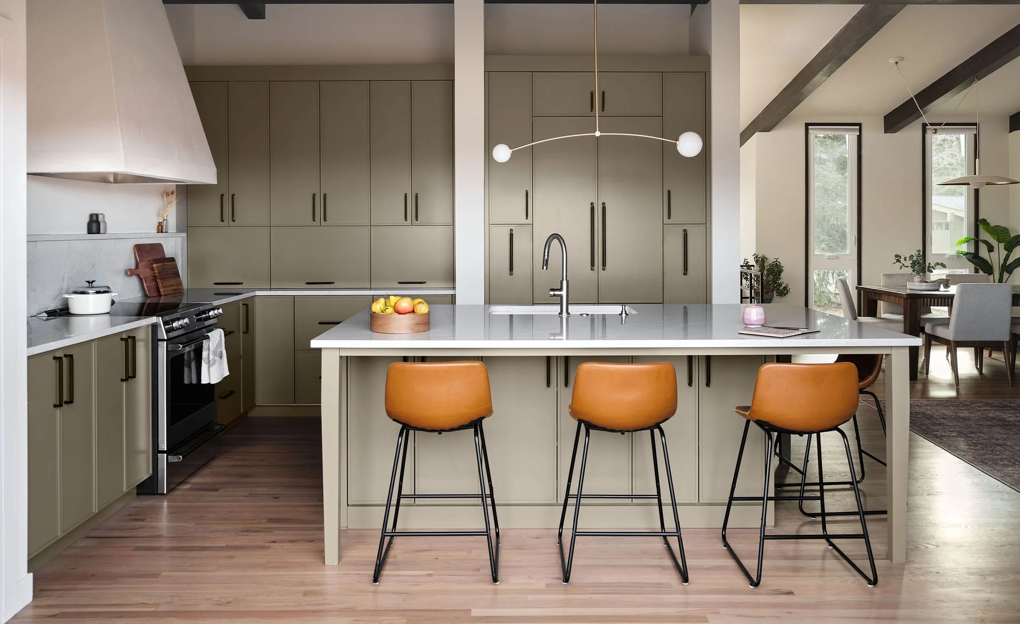
The original kitchen sat in the middle of the house, walled off from the views and the deck and most of the daylight the home had to offer. Relocating it to the north side of the house was the move that unlocked everything else, and once we made that decision the rest of the design fell into place behind it. We replaced a standard sliding door with a ten-foot folding door system that opens the kitchen directly onto the deck, so the room can stretch out into the backyard whenever the weather cooperates. Behind the kitchen, a walk-in pantry adds more than fifty linear feet of storage that was never going to fit inside the cabinetry itself.
The island is the social center of the room. It's where the seating lives, where the sink and dishwasher landed, and where the household ends up congregating without having to be invited. There was one structural complication we couldn't engineer our way out of, a load-bearing post buried in the central interior wall that had to stay where it was. Rather than fight the post, we built a non-structural companion wall under the neighboring beam and used the resulting pocket as the intentional home for the built-in refrigerator and a run of pull-out storage. What started as a constraint ended up giving the kitchen its strongest architectural moment.
The materials are quiet on purpose. Natural wood tones on the floor and the ceiling beams set the temperature, and the cabinetry and stone soften the rest of the palette around them. The range hood deserves a particular mention. We used an insert to give us the freedom to frame a custom hood whose angles echo the angles already at work in the home's architecture, and our craftsman troweled micro-cement on the surface to give it a subtle texture you only notice when you stand close. The kind of detail that earns its place by not announcing itself.
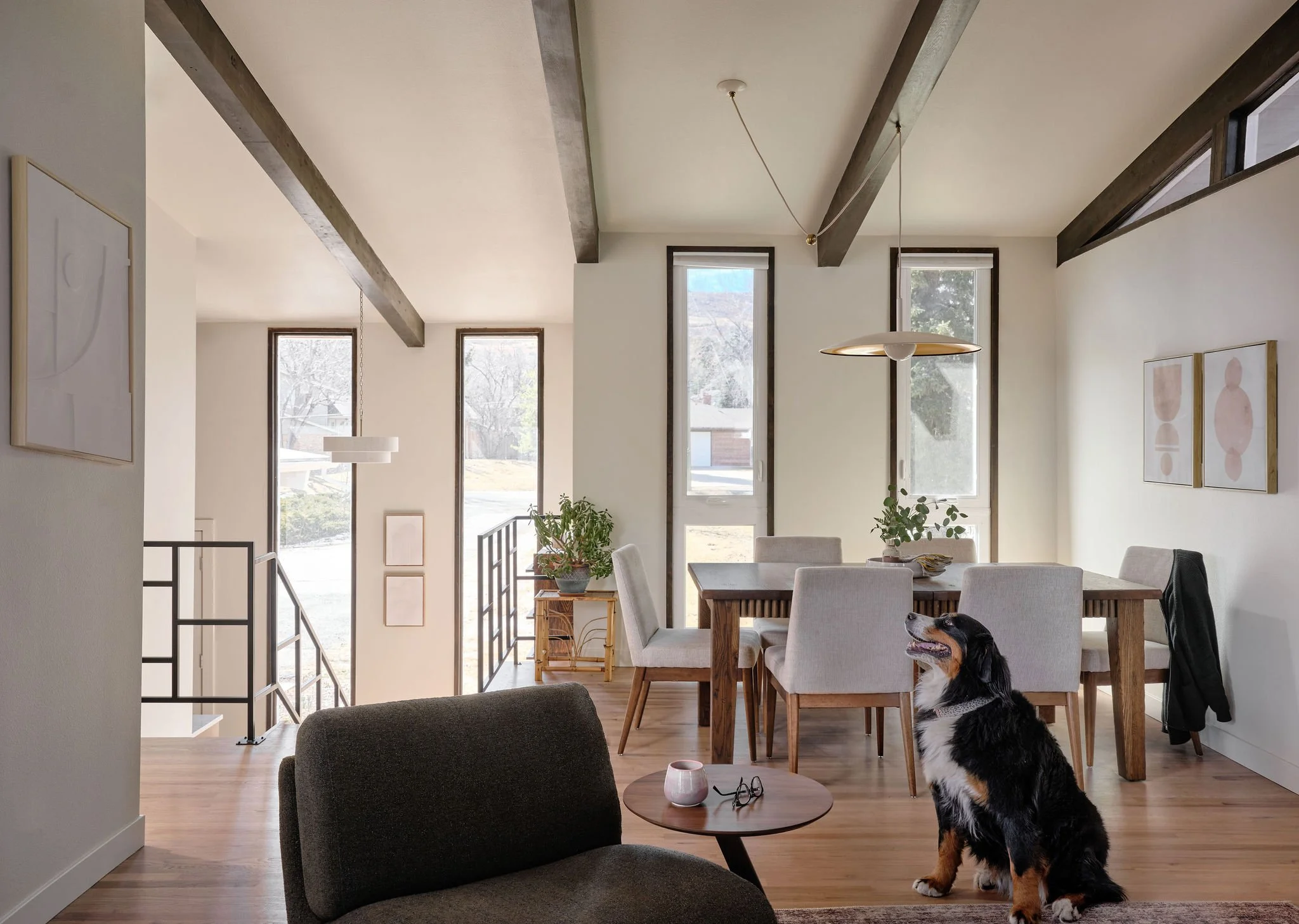
the dining
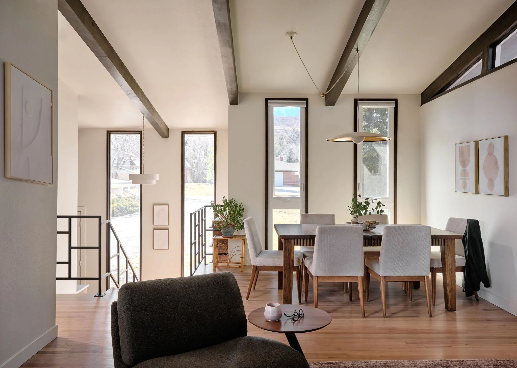
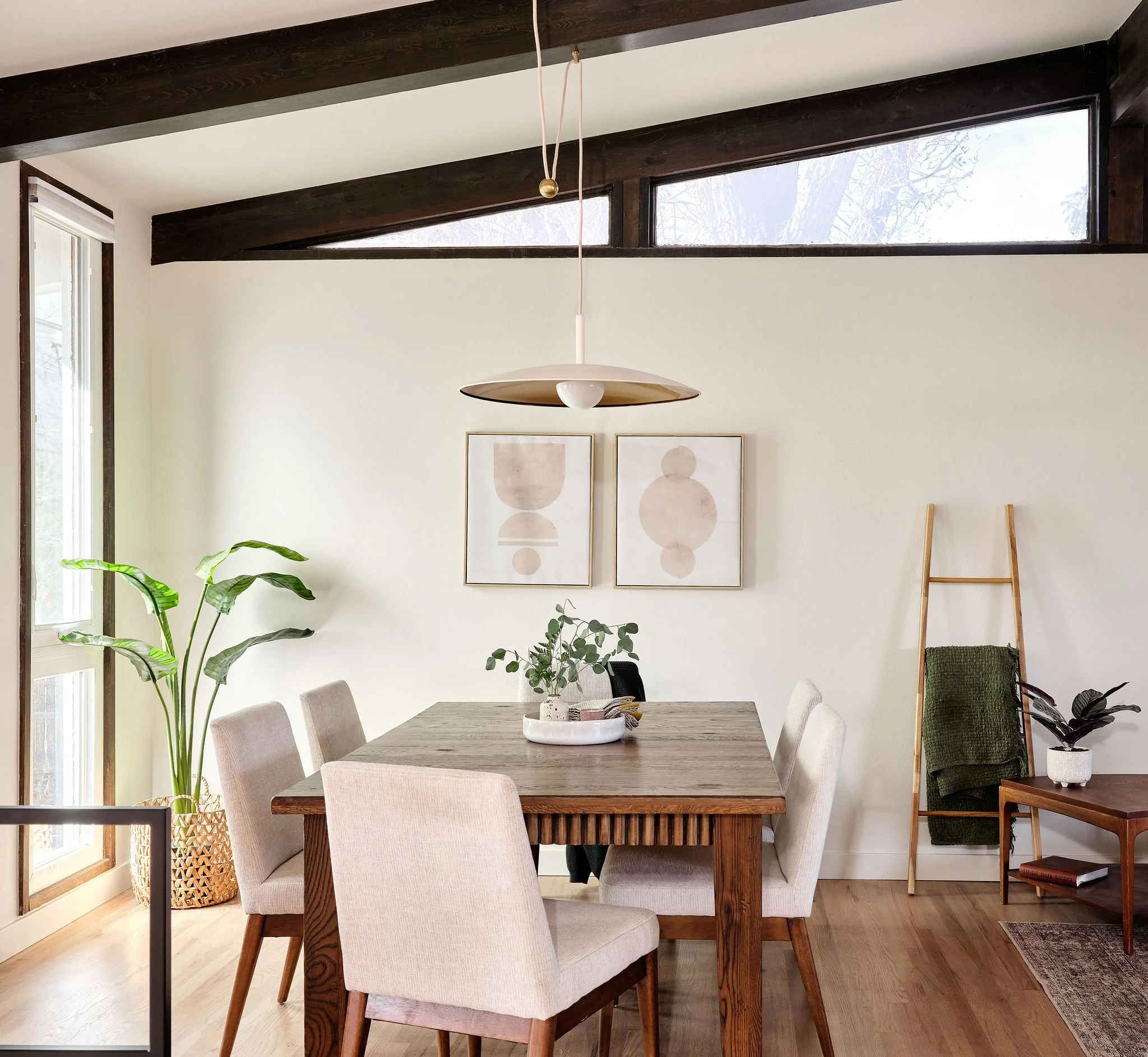
The dining room sits at the architectural crossroads of the house. The foyer, the living room, the hall, and the kitchen all open into it, which means there are sightlines to this room from nearly every other space on the main level. A room with that much visual responsibility couldn't afford to be loud, and our intent throughout the design was to let the architecture of the house steal the show at every turn rather than competing with it.
The challenge underneath that intent was a practical one. The original single-pane windows, paneled ceiling, and walls had almost no insulation, and our clients had described living in the house as feeling like they lived in an attic. We took the drywall down to the studs to bring the insulation up to a livable R-value, and that work let us preserve the home's most distinctive architectural feature — the original triangular single-pane windows — while replacing the vertical windows with functional double panes. We also lowered the vaulted ceiling four inches to fit insulation above the beams and to run electrical for a lighting plan that hadn't existed in this part of the house before.
The clients had a beloved vintage table they wanted to keep in the room, and refinishing it with new reeded wood details let it read as though it had always belonged in the new space. The rest of the room runs neutral on purpose, so the contrast between the wall color and the original wooden beams overhead can do the work it was designed to do.
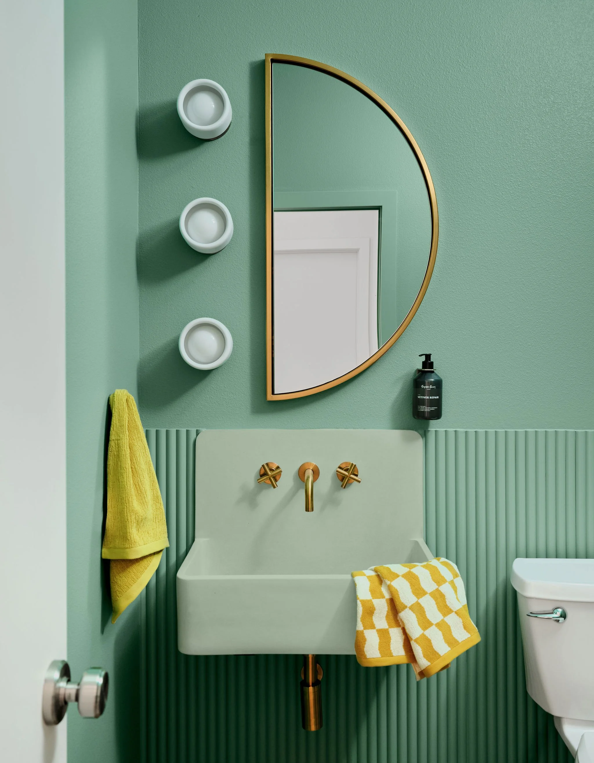
the powder bath
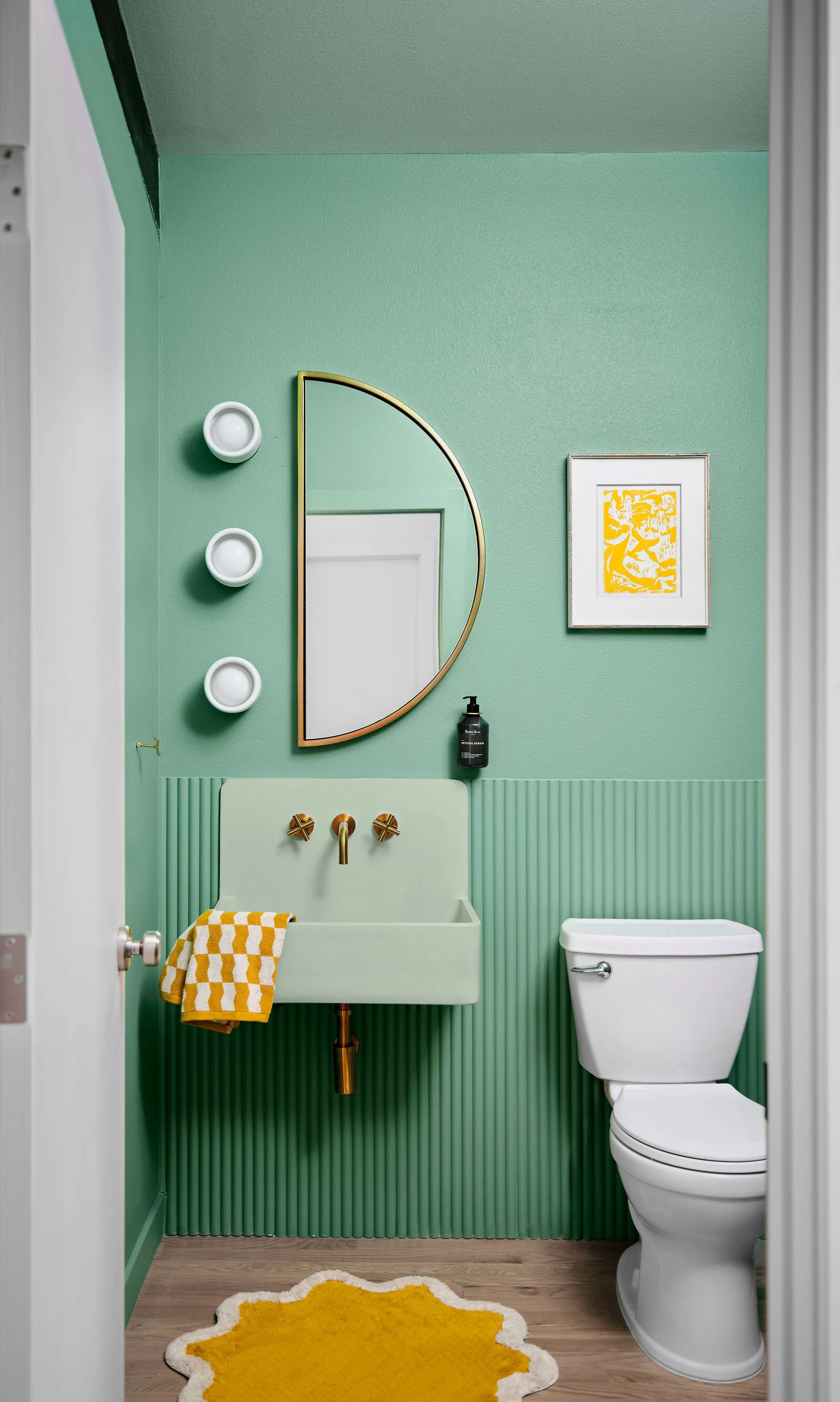
The powder bath became the colorful playground of the house. After the careful neutrality of the rest of the main level, we wanted this small room to deliver a moment of pure pop for the guests our clients love hosting, and the only rule we set for ourselves was that the room still had to feel like it belonged to the same architectural family as everything around it. Two exposed beams, a vaulted ceiling, brass accents, and a simplicity of form keep it tethered to the home's broader design language even as the color goes loud.
We relocated the powder bath to the interior of the home so it would feel less exposed to the kitchen and the main living areas, with a short new hallway providing a buffer of privacy on the way in. The room itself is sized by the existing ceiling beams. The east and west walls center on the beams overhead, which let the proportions of the room feel inevitable rather than imposed.
The starting point for the palette was a pistachio concrete sink the client had been quietly hoping for since the project began. Once we found the right one, we leaned into the color entirely. The sink color carries up onto the ceiling, and a more saturated cousin of the same green wraps the walls. A semi-circle mirror and a trio of circular wall sconces deliver the sense of play we wanted, and the asymmetry breaks up the rigid geometry of the architecture in a way the room needed. The wall-mounted concrete sink itself was the construction tightrope of the project, with no margin for error in the rough-in. Our build team nailed it.