
Aging in Place Doesn't Have to Look Like It
There's a phrase we hear a lot in our line of work, and we have a complicated relationship with it. Aging in place. The phrase isn't wrong, exactly. It describes a real and important goal, which is helping homeowners stay in the homes they love as their lives and bodies change. The trouble is that the design world has spent decades attaching that phrase to a very particular look, and the look isn't doing anyone any favors.
You know the one. White grab bars on white walls, a fold-down shower seat that looks like it came from a hospital supply catalog, fluorescent overhead light, beige everywhere. It's the visual shorthand for "someone older lives here," and it sends a message to the homeowner that their needs are now somehow separate from their taste. As designers based in Denver who do this work for a living, we'd like to make a case for retiring that aesthetic entirely. Aging in place doesn't have to look like aging in place, and a lot of the most rewarding accessible bathroom design we've done lately is proof of it.
What Aging in Place Actually Asks of a Home
Most homes weren't built with the long arc of a life in mind. They were built for a single moment, usually a moment when the original owners were younger and more mobile than they will be in twenty years. Stairs that felt like nothing in your forties become a daily calculation in your seventies. Bathrooms with high tubs and tight doorways that worked fine for one family stop working for the next chapter. The house didn't change. The person living in it did.
Designing for aging in place means looking at a home the way a long-term resident actually uses it, and adjusting the architecture so the home keeps cooperating. The big interventions are usually well known. Wider doorways. Curbless showers. Heated floors. A primary bedroom and full bathroom on the main level. Lever-style door handles instead of round knobs. Lighting that's bright enough to actually see by without being harsh.
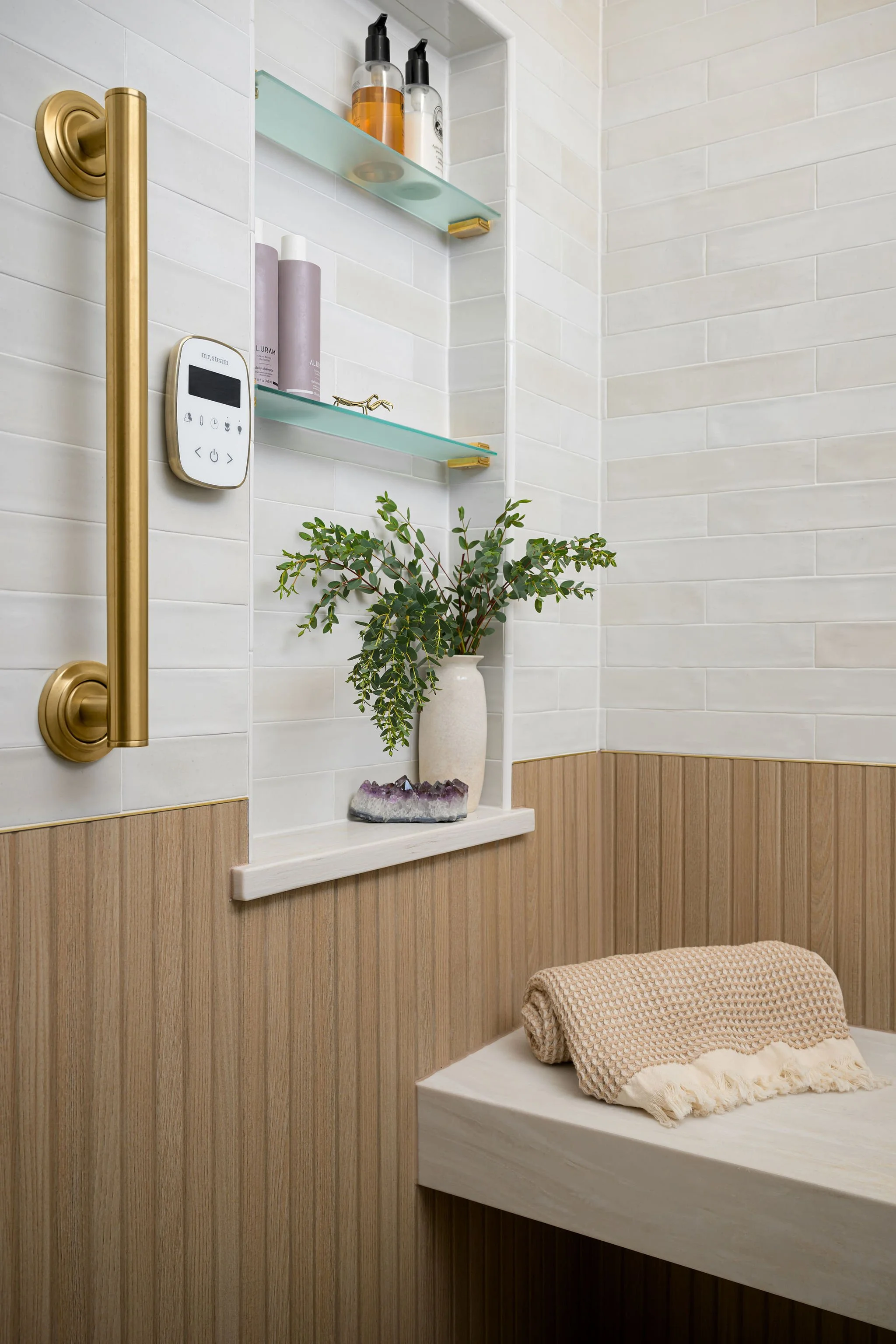
The smaller interventions, the ones that don't make the brochures, are often where the real magic happens. A ledge wall in a shower that doubles as a leaning surface, a bench at exactly the right height for safe transitions, and a grab bar placed where someone naturally reaches. These choices might look like nothing in a rendering, but they change how a person moves through their day.
Why the Design Has to Pull Its Weight
Here's where we draw a hard line. A space that's accessible but ugly is a space the homeowner will resent every time they walk into it. A space that's beautiful but unsafe is a space that fails the only test that actually matters. The job is to do both at once, and to do them in a way that doesn't read as compromise.
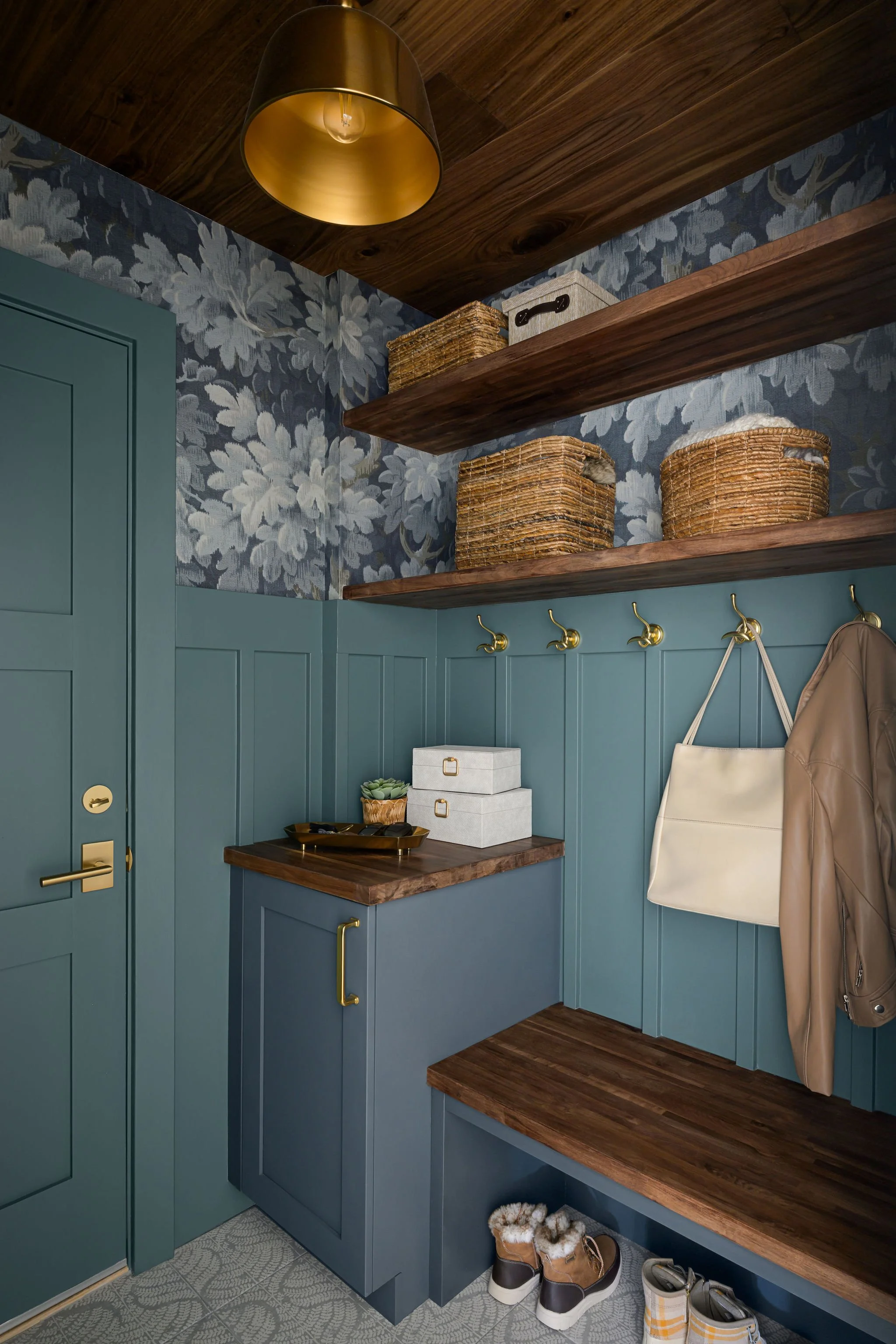
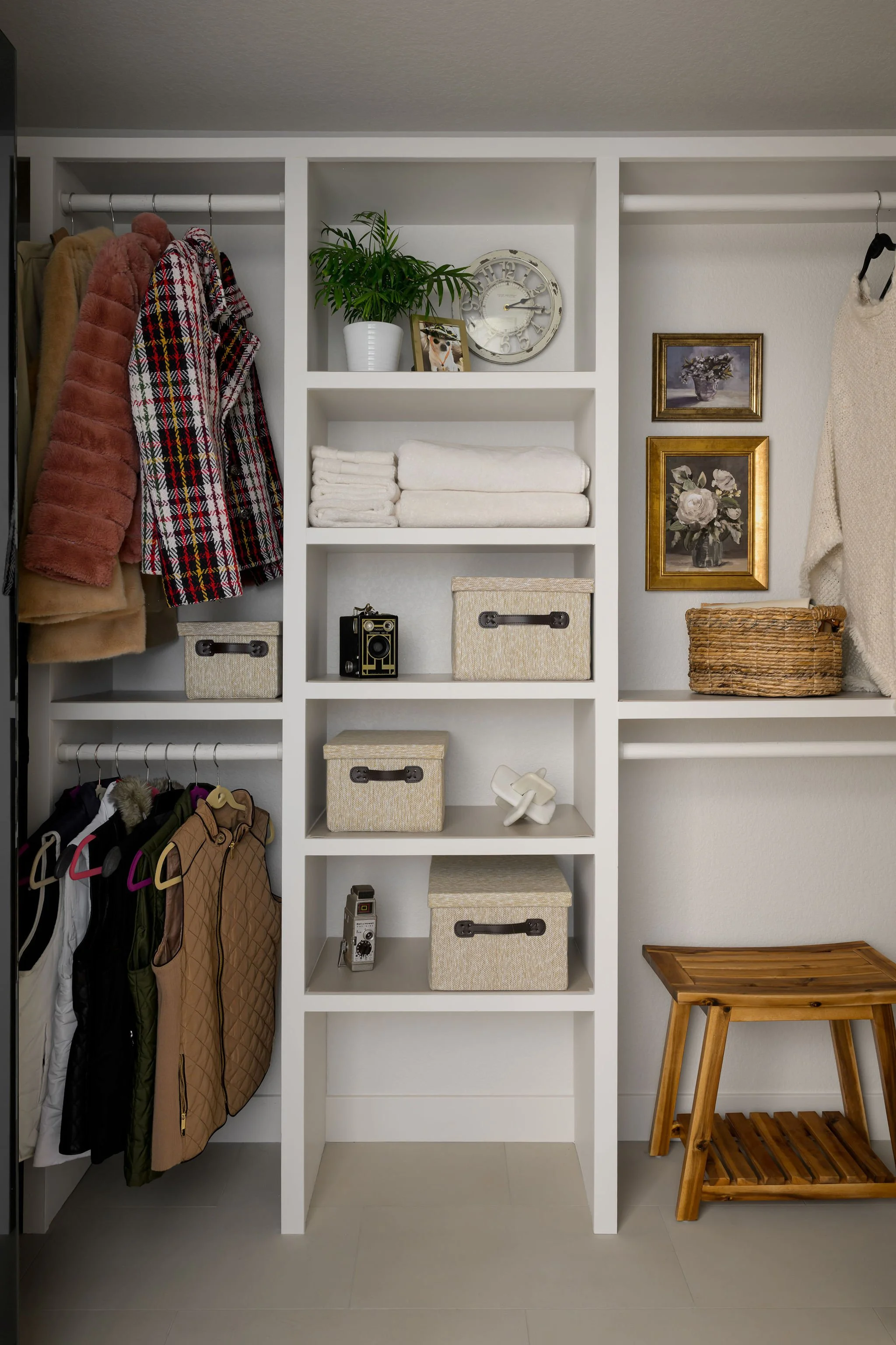
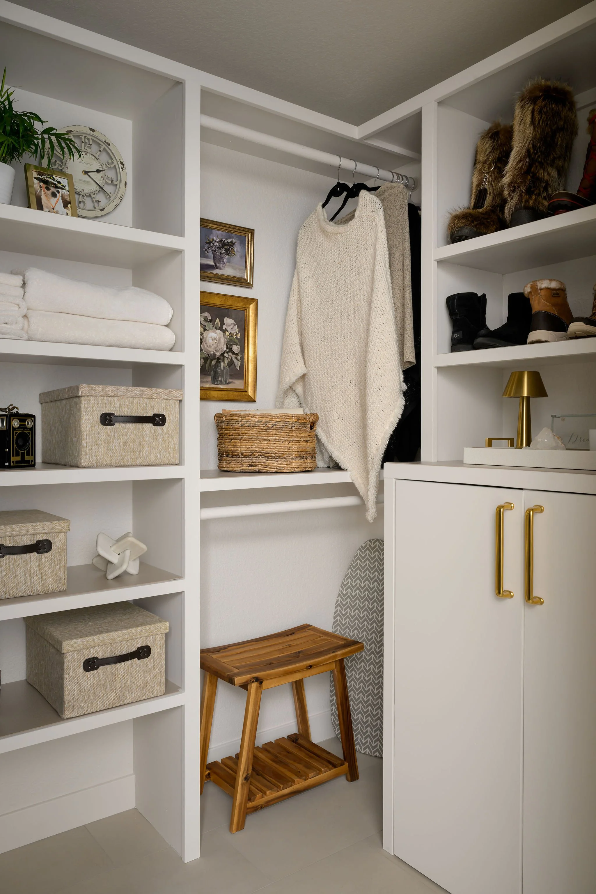
We finished a project recently in Castle Pines that became, for us, a kind of mission statement on this point. Our client wasn't ready to leave her home, but a change in her health meant the upstairs bathroom was no longer a reliable option. The main level didn't have a full bath, and there was no obvious place to put one without losing other parts of the house she loved. The solution turned out to be converting one bay of her three-car garage into livable space, which gave us the room to build a full accessible bathroom, a walk-in closet, and a proper mudroom and laundry on the level she actually lived on.
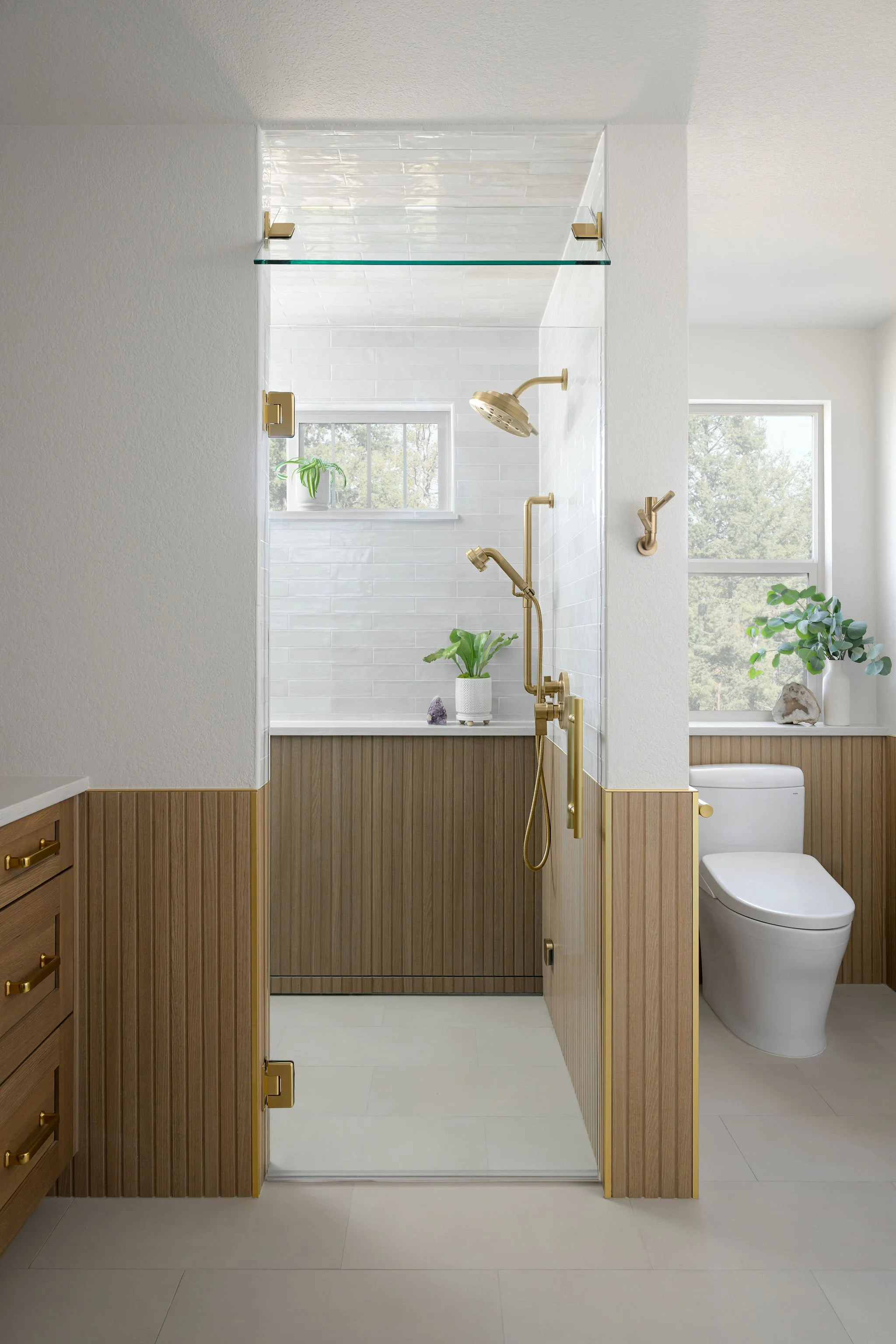
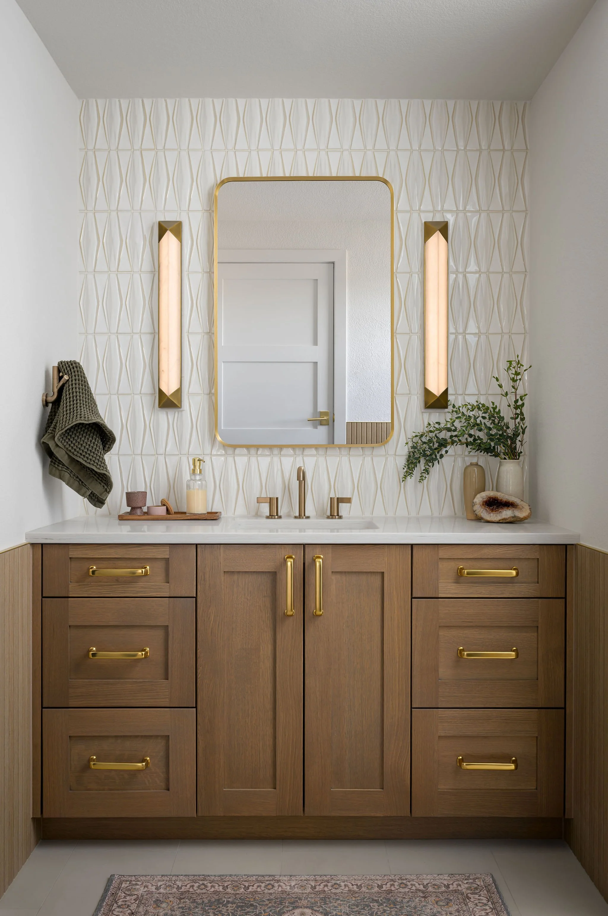
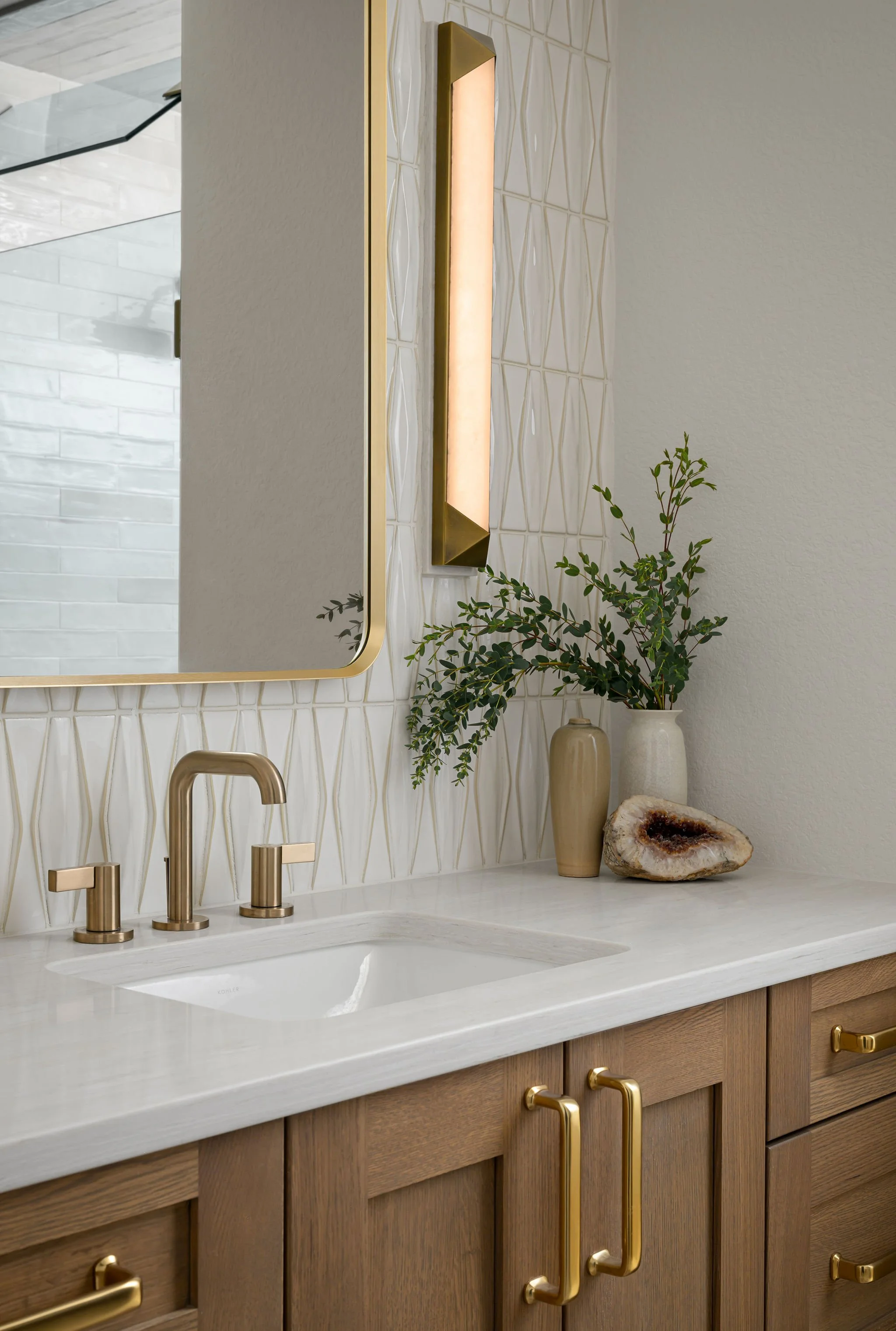
The bathroom we ended up with is fully accessible. It also happens to be one of the most beautiful spaces we've ever built. The shower has no curb and no threshold. The drain is hidden inside a 36 inch ledge wall that doubles as a leaning surface and a push-up support for the bench seat. Aged brass grab bars at the toilet and the shower do their structural work, but they're finished like jewelry rather than safety equipment. The vanity is quarter sawn white oak with brass hardware. The tile is dimensional and hand-glazed. There is no part of this room that says "accessible" before it says "beautiful," and that's exactly the order it should go in.
What We'd Tell Anyone Starting This Conversation
If you're in your forties or fifties and starting to think about how your home will work for you in twenty years, you're already ahead of most people. Universal design works best when it's planned in rather than retrofitted, and the choices made during a major remodel are far easier to make accessibility-friendly the first time than they are to redo later. Wider doorways, blocking in the walls for future grab bars, a curbless shower instead of a tub, and a single-level primary suite are all decisions that cost little or nothing more during a remodel and become wildly more valuable later.
If you're already in a moment where the math has changed, like our Castle Pines client was, the work is bigger but it isn't impossible. Most homes have square footage hiding in plain sight. A garage bay, a formal living room nobody uses, an oversized hallway. Finding it and reshaping it around how a person actually lives is the job, and it's a job we love.
The goal, in the end, isn't to design for a future version of yourself you don't recognize. The goal is to design for the same person you've always been, with a home that's quietly evolved to keep meeting you where you are. That's what aging in place should mean. That's what we try to build every time.
If you're thinking about a remodel in Denver or the surrounding metro and want to factor longevity into your design from the start, we'd love to talk it through. Get in touch anytime.