

Stop and smell the wallpaper
Historic Whole Home Renovation
Our clients had loved this little historic house for years. What they wanted was to make it theirs, which meant the function they had been missing and every ounce of play they had been holding back.
A historic floor plan without an open concept usually gets treated as a problem to solve. We think it is the opposite. Each room here holds a full personality of its own, and the pleasure is in how they layer as you move through.
The long sightline running from the front of the house to the back became our thread, and every decision had to earn its place in it. One room hands you off to the next.
Room
by Room
Drag any comparison. Click any photo to enlarge.
The Foyer
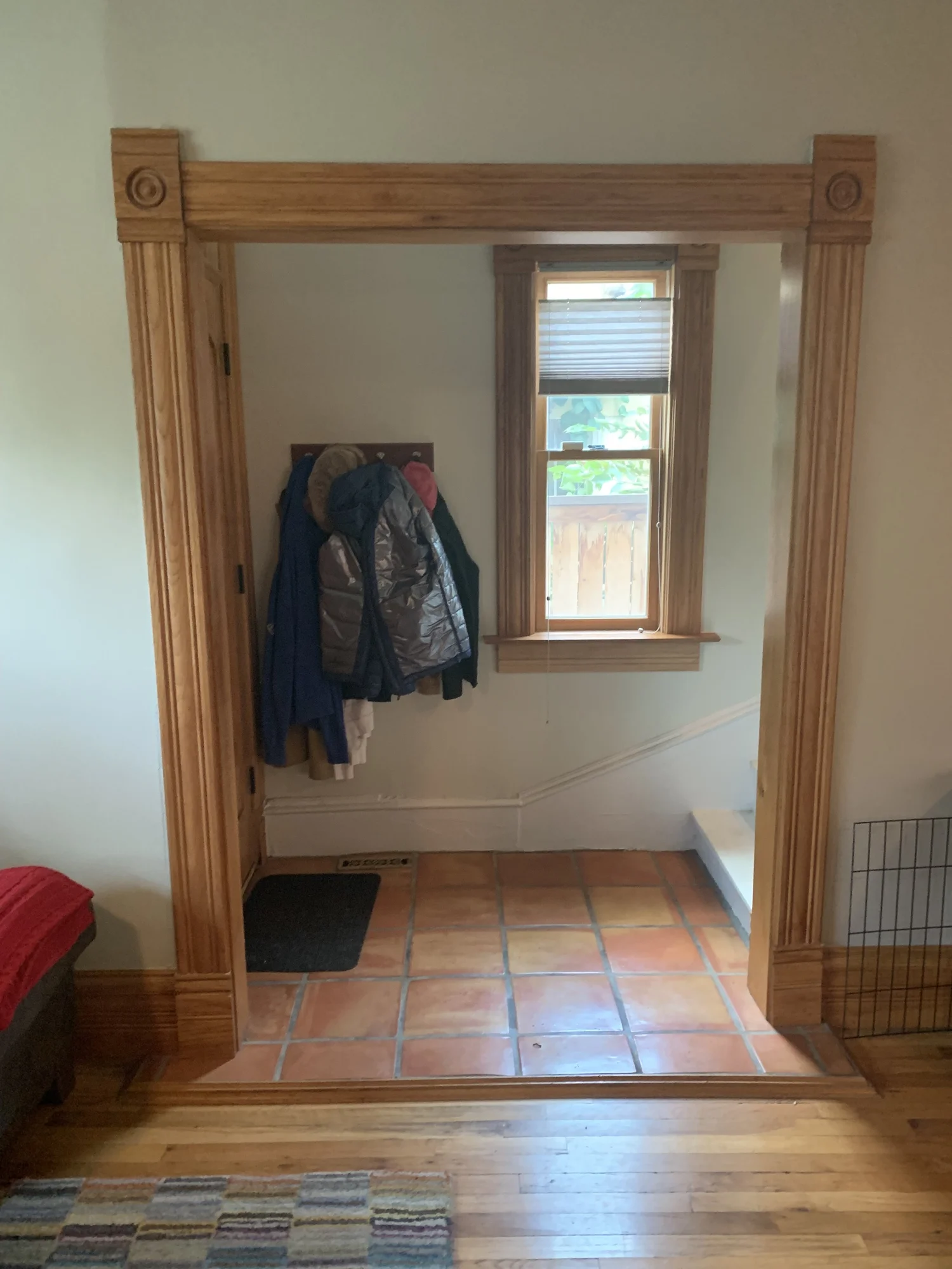
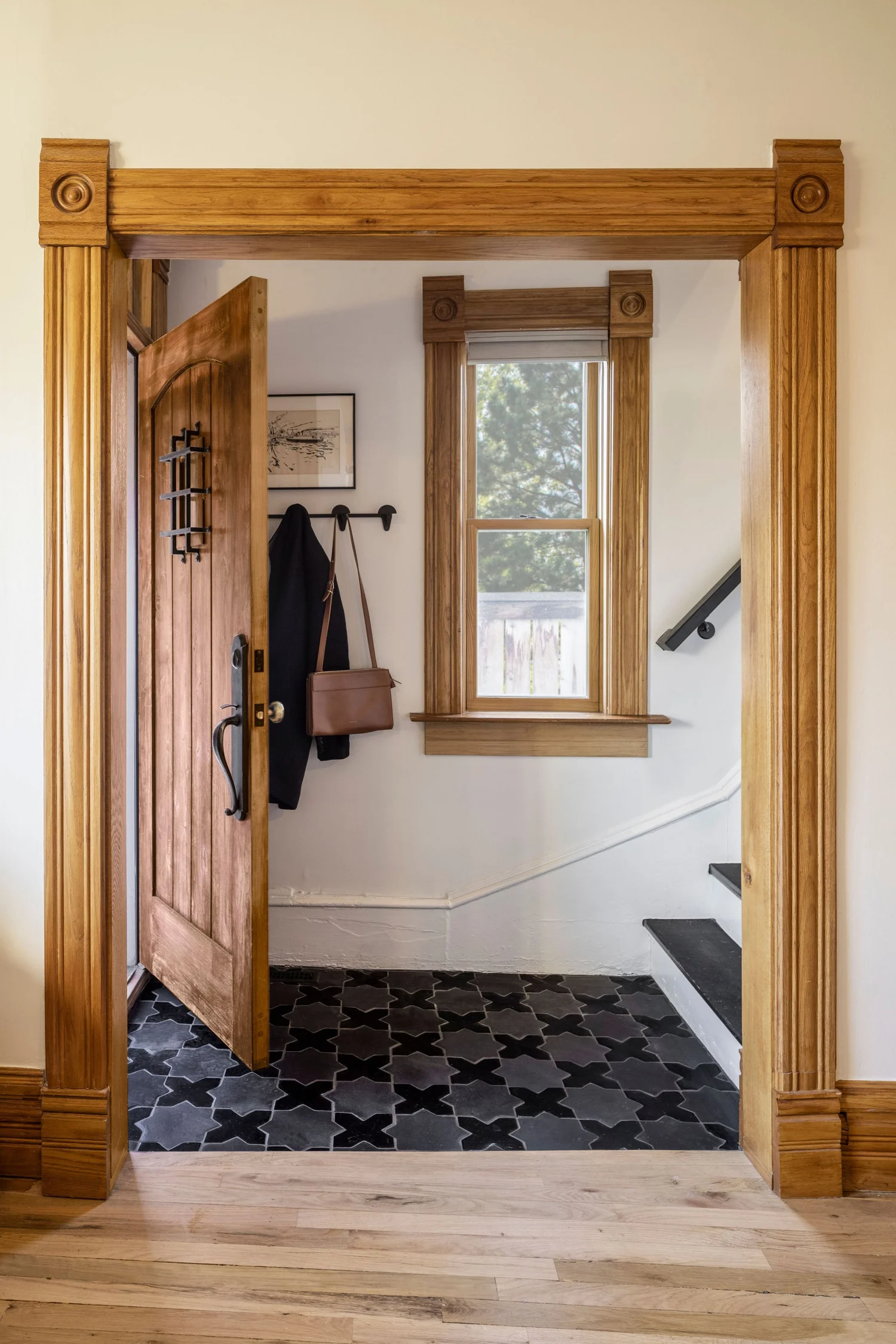
The foyer already had good bones and plenty of warm wood. What it needed was contrast. We laid a star and cross tile in alternating matte and gloss, which gives the floor a depth that shifts depending on where the light is coming from, then carried the black finish up the staircase.
Small moves did the rest. We leveled the floor between the foyer and the living room, added a ceiling light, and put a railing on the stair. The secondary entrance picked up hook storage so the everyday clutter finally has somewhere to land.
The Living Room
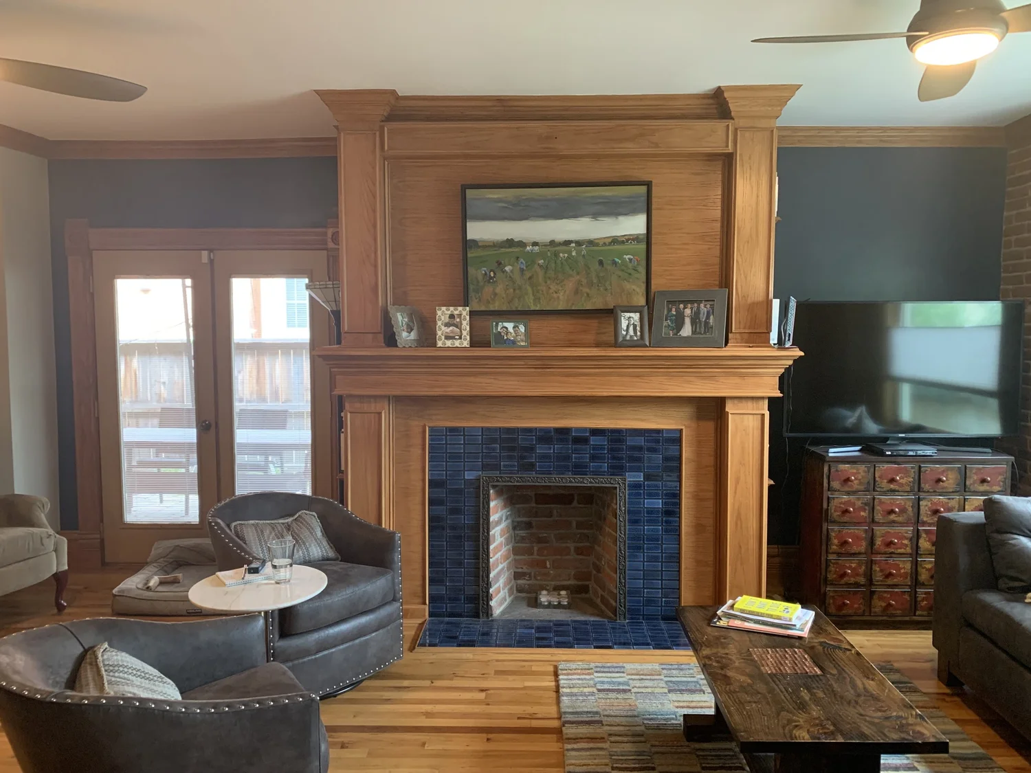
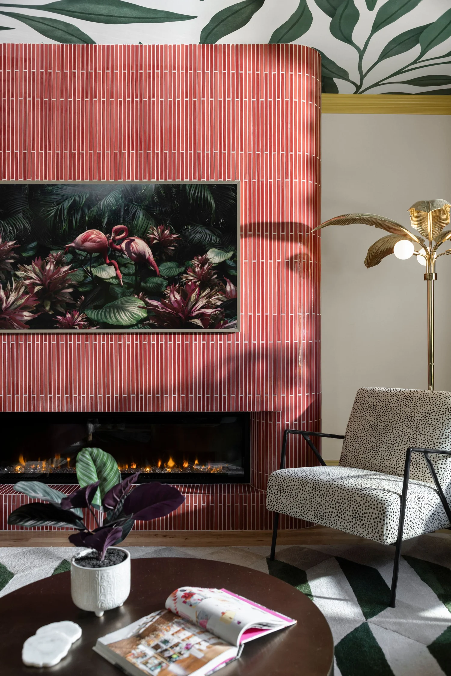
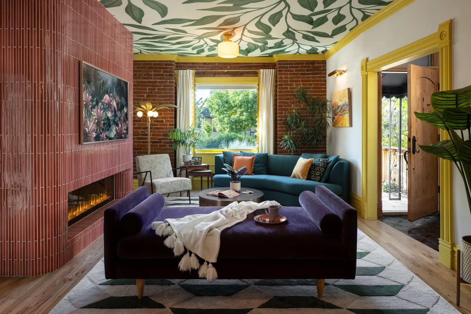
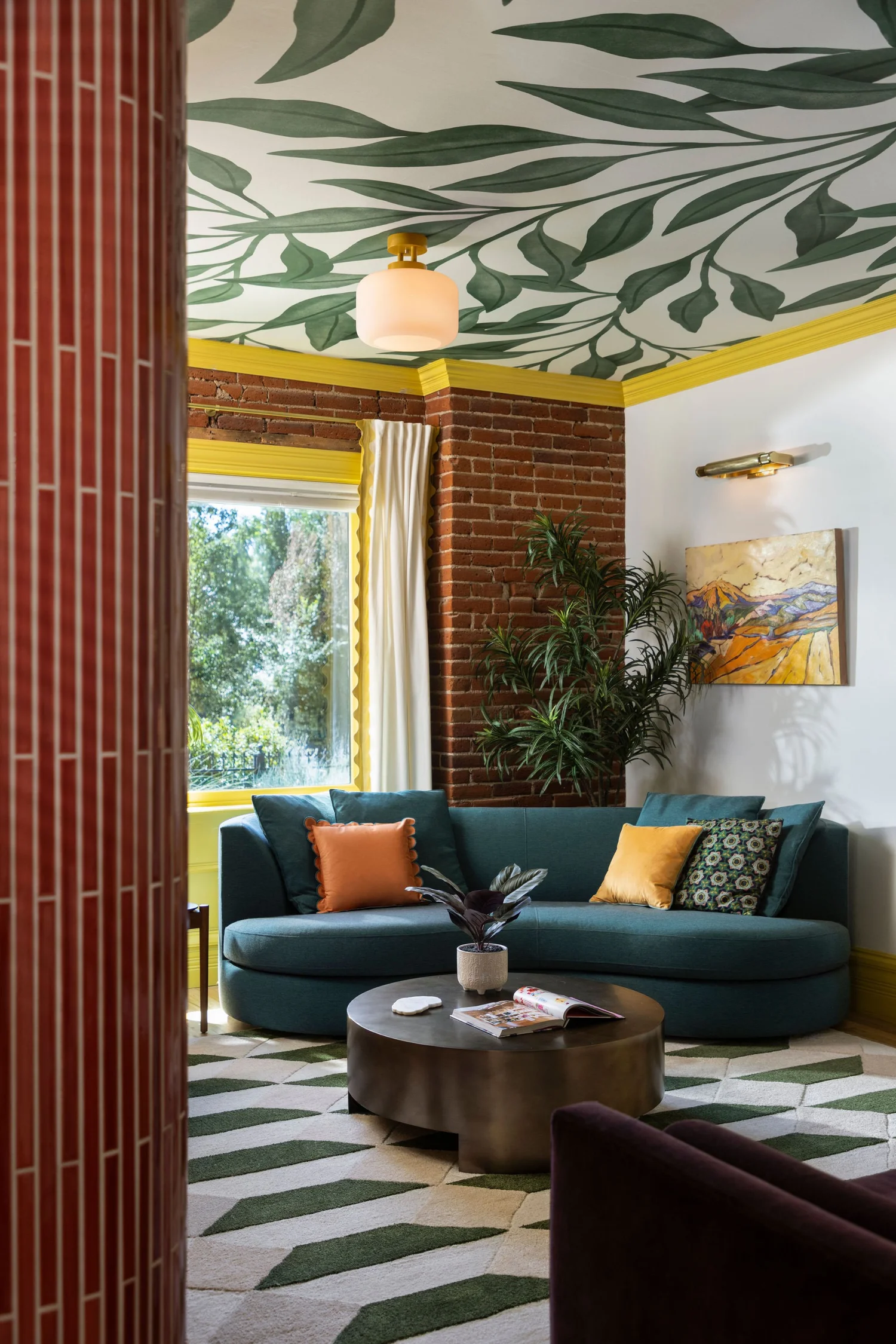
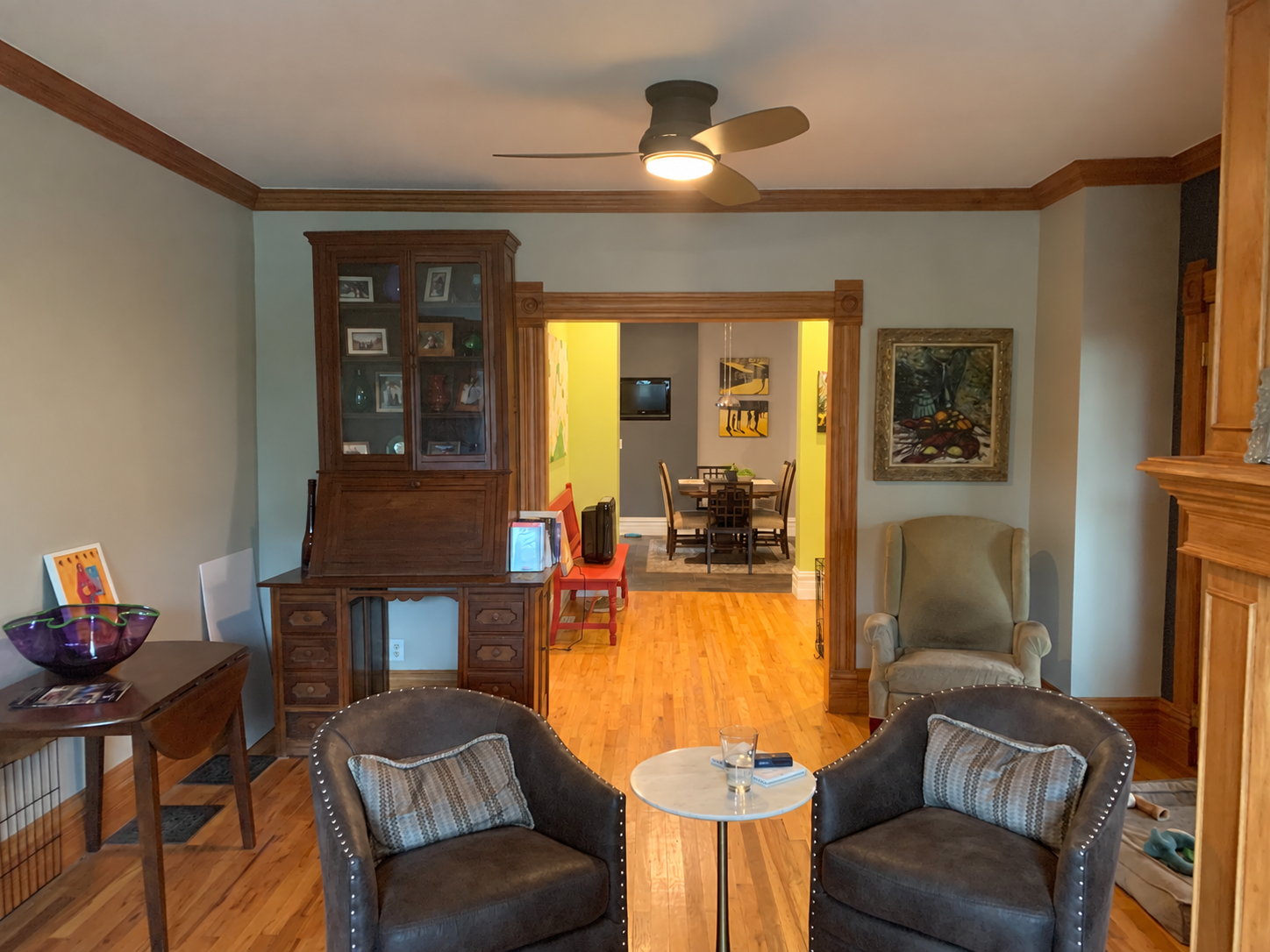
The living room is the first thing you see and the introduction to everything after it, so it had to set expectations. The home's original fireplace was long gone, and a bulky wood surround stood in its place taking up more of the room than it earned.
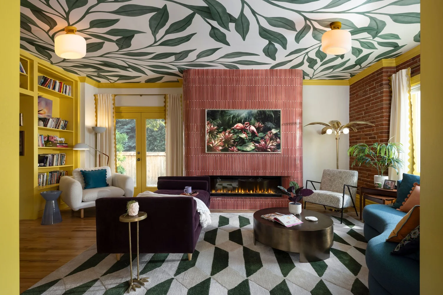
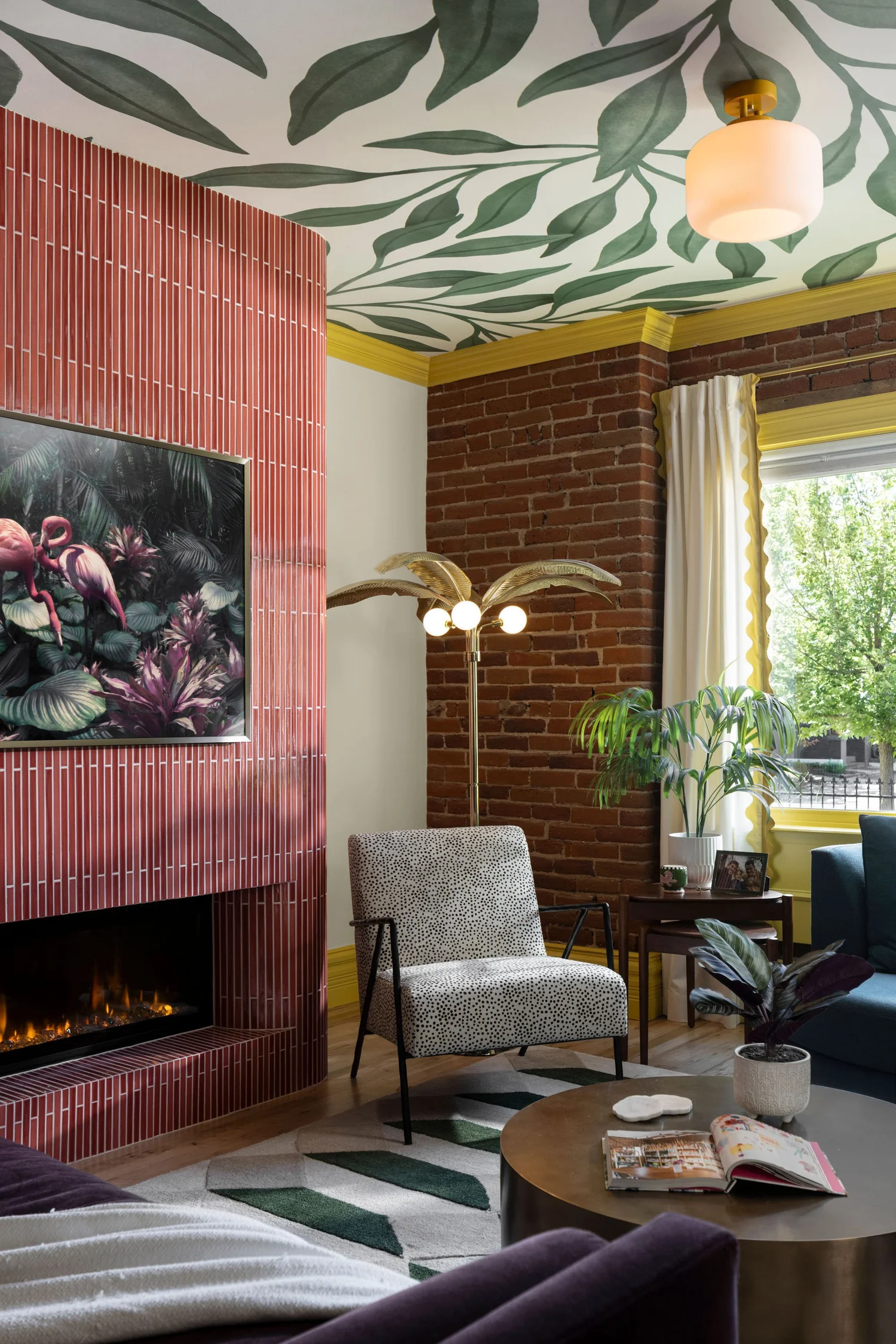
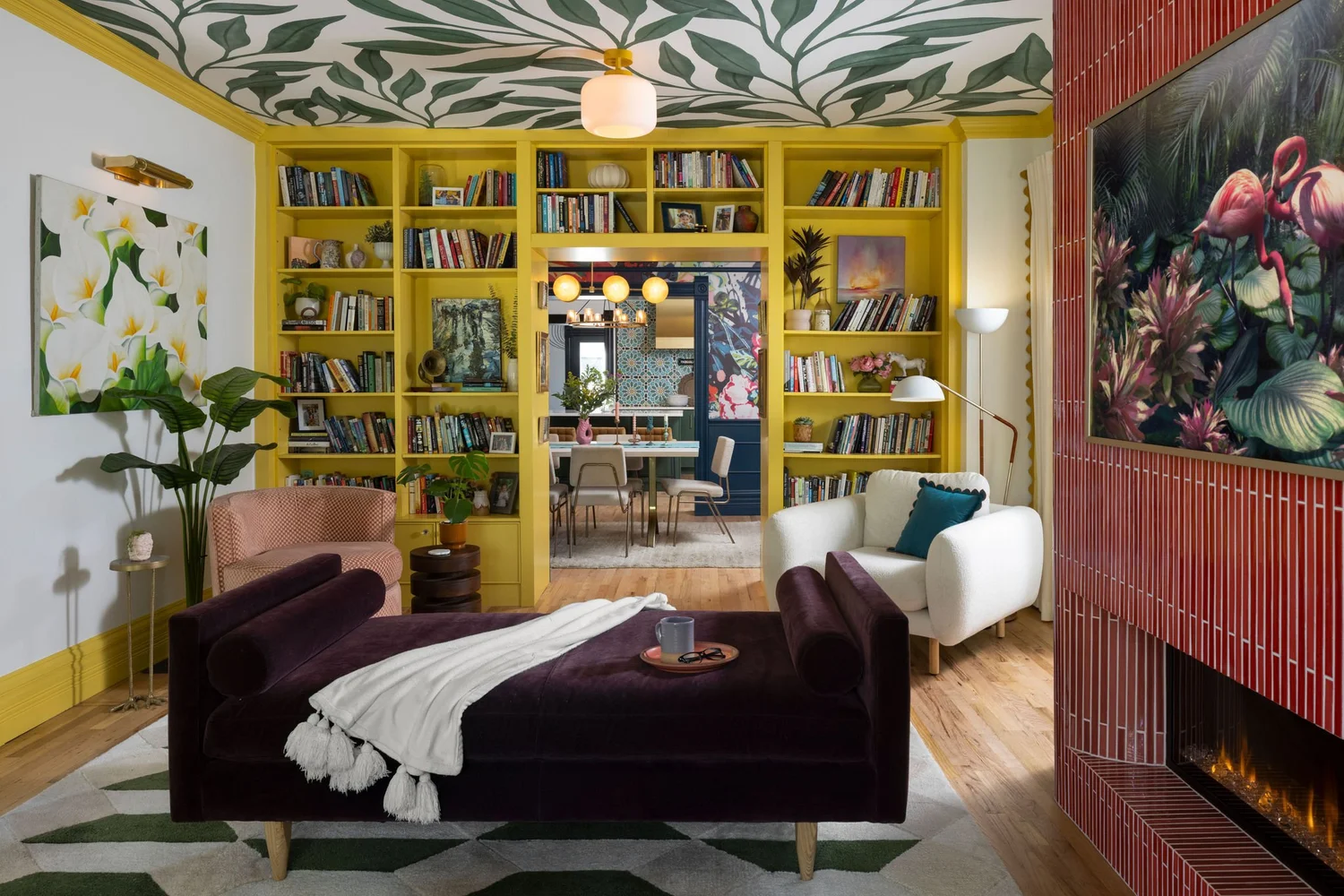
What replaced it is the piece we are proudest of in this house. One inch by eighteen inch tile in a soft pink, set in a one third pattern that reads as gentle horizontal banding, with curved corners and every outside edge mitered. The art TV rests on an articulating arm that folds into a recess behind it, so it sits flush and behaves like art rather than a screen.
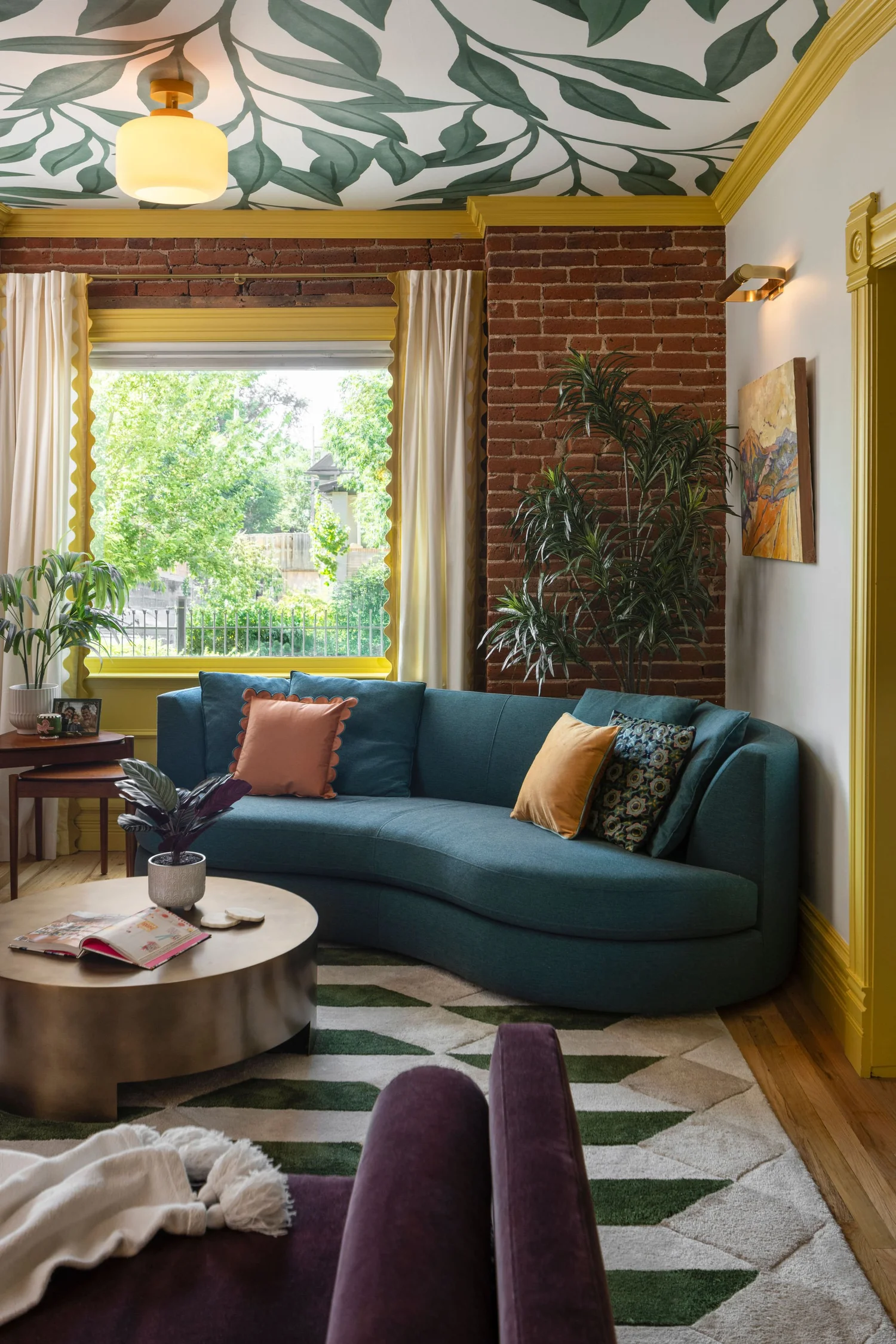
The ceiling carries a leaf mural that plays with scale and keeps the pattern overhead, which let the original brick wall stay exactly as we found it. A geometric rug pulls the same colors back down to the floor in a more orderly way.
The room is long and rectangular, which had been a furniture problem for the owners for years. Rather than fight the shape we used it, building two conversation areas with a purple daybed in the middle. On a quiet night it is the best seat in the house for the fire. When they entertain it splits the room into two groups who can still talk across it.
The Library
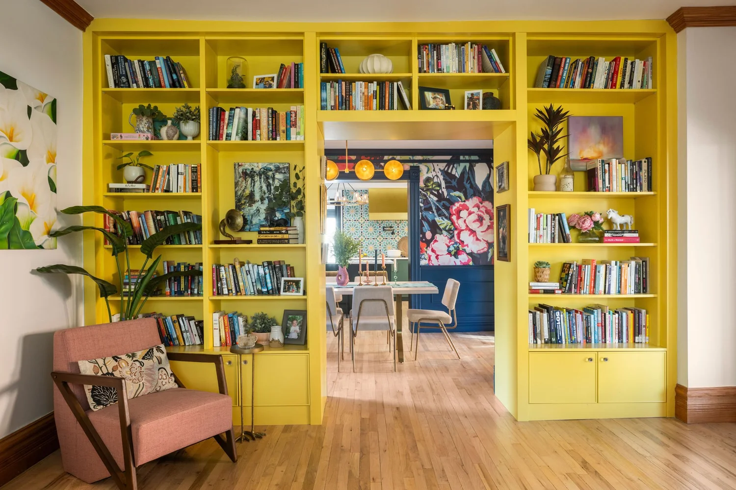
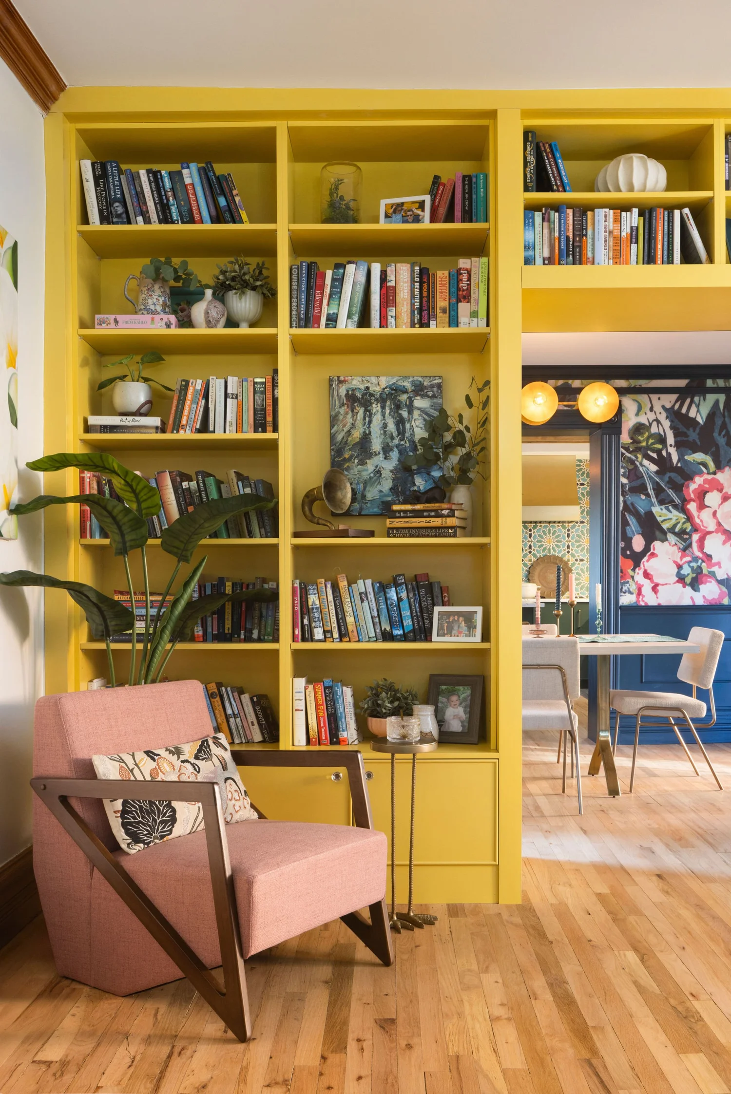
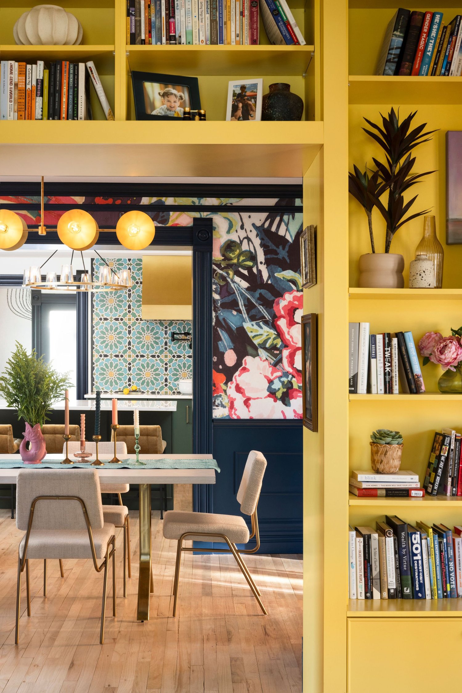
Our clients have been building a book collection for decades and had nowhere to put it. The blank wall in the living room was doing nothing for anyone, so it became open shelves above and closed cabinets below, which keeps the games out of sight and the books on display where they belong.
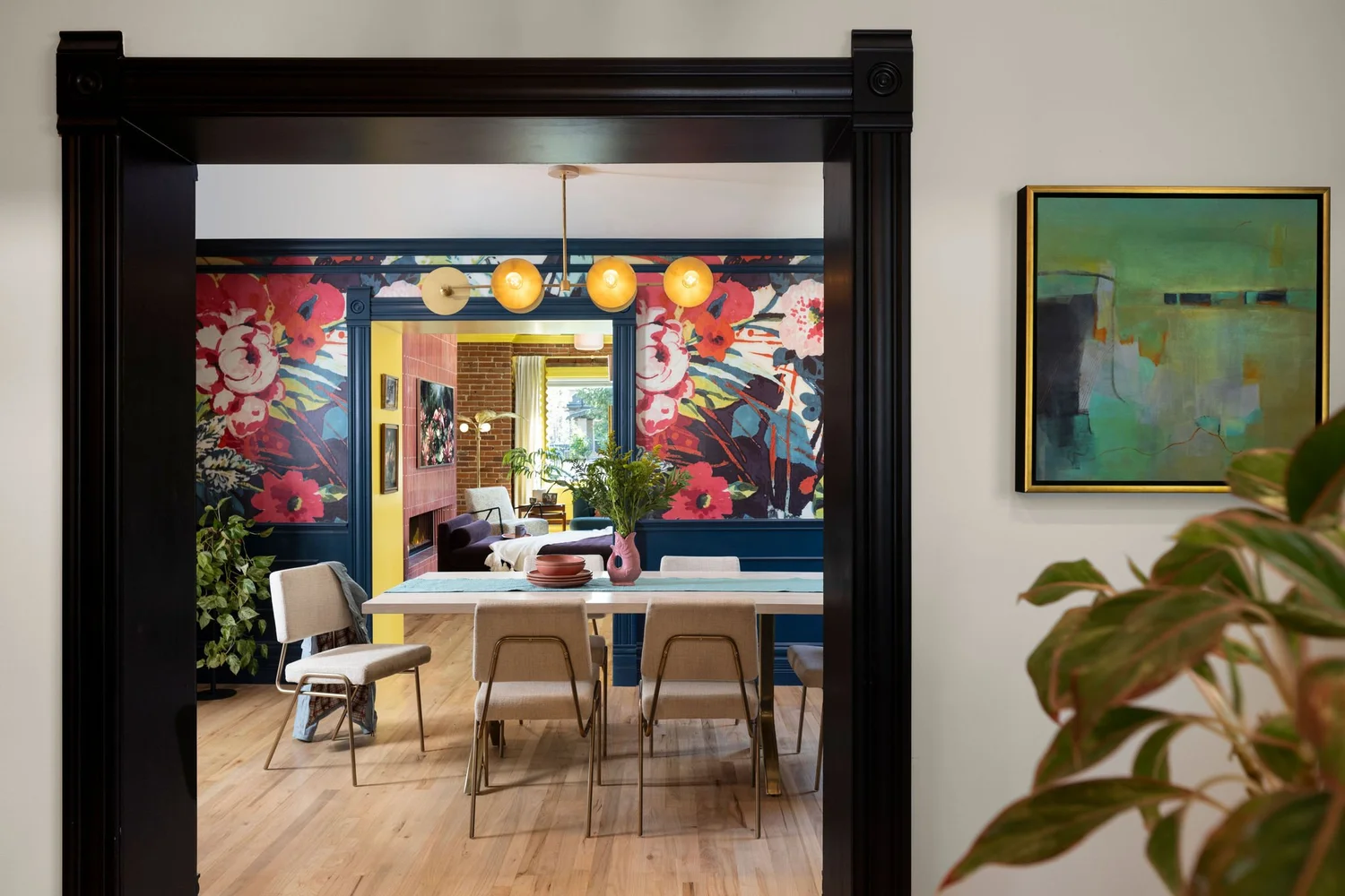
We used the depth of the cabinetry to build a real entry into the dining room. Walking through it, the books close in around you for a moment before the next room opens up. It is our favorite few feet in this house.
The yellow was the last color chosen on the entire project. It pulls from the yellow in the kitchen tile and pushes against the deep tones waiting on the other side of that doorway. We wanted an old world library without the gloom that usually comes with one, a room that asks you to actually read the books.
The Dining Room
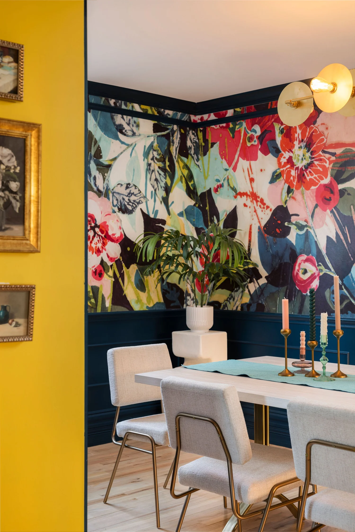
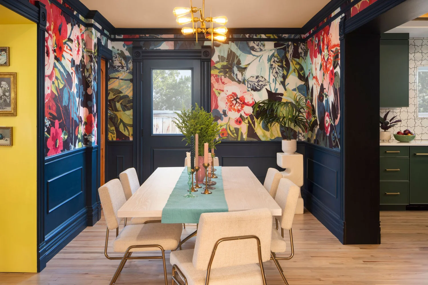
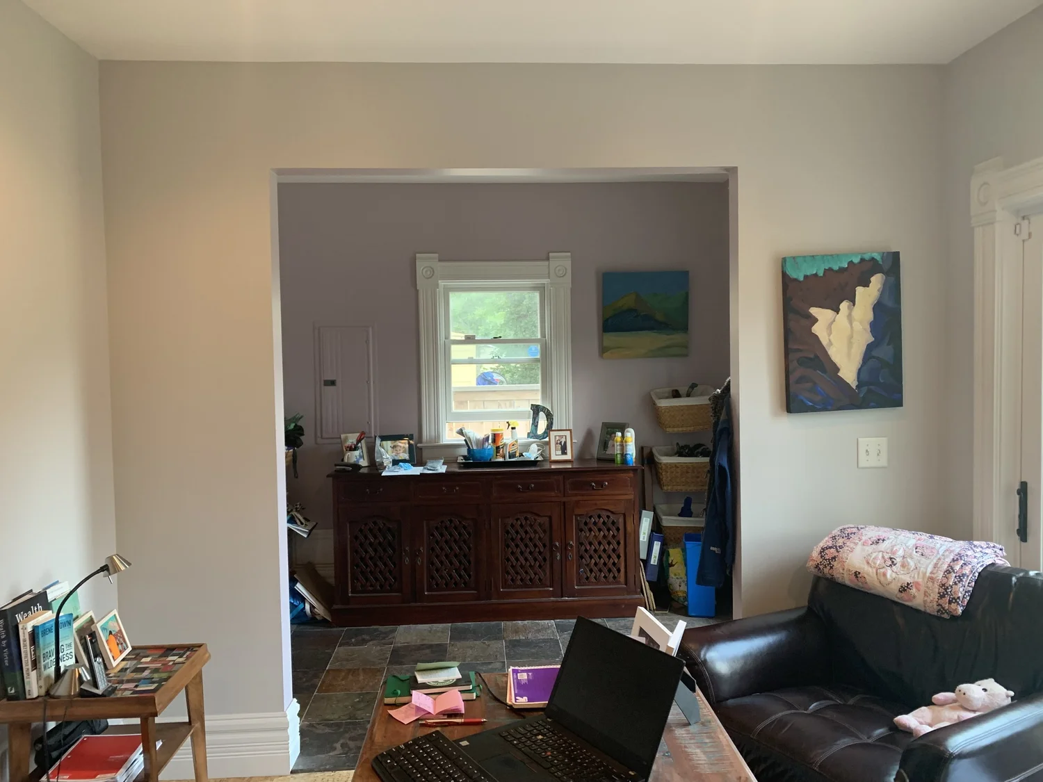
At some point in this home's life, an evil-doer put a bathroom in the dining room and took half the usable square footage with it. What was left worked as a gallery you passed through on the way somewhere else, not a room anybody stayed in.
We relocated that bathroom to a small hall off the kitchen and gave this room its footprint back. It seats eight now, and it has turned into the room everyone ends up in.
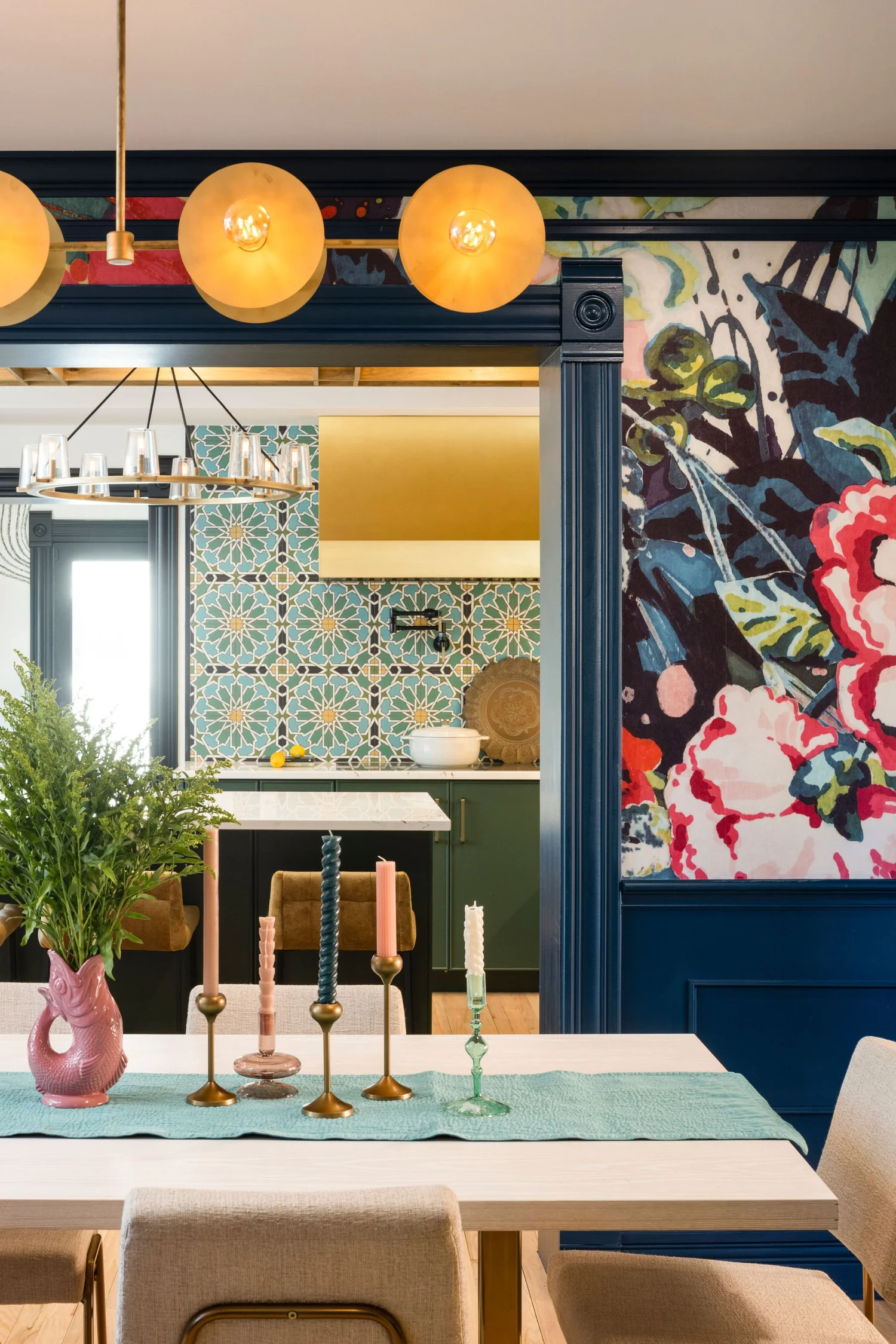
The floral mural is the loudest thing in the house and it has earned the right to be. Custom paneling and trim frame it, and we ran a picture rail a few inches below the crown molding, partly for the detail and partly so art can hang without anyone putting a nail through the wallpaper. French doors open to the patio and bring in light and cross ventilation.
The Kitchen
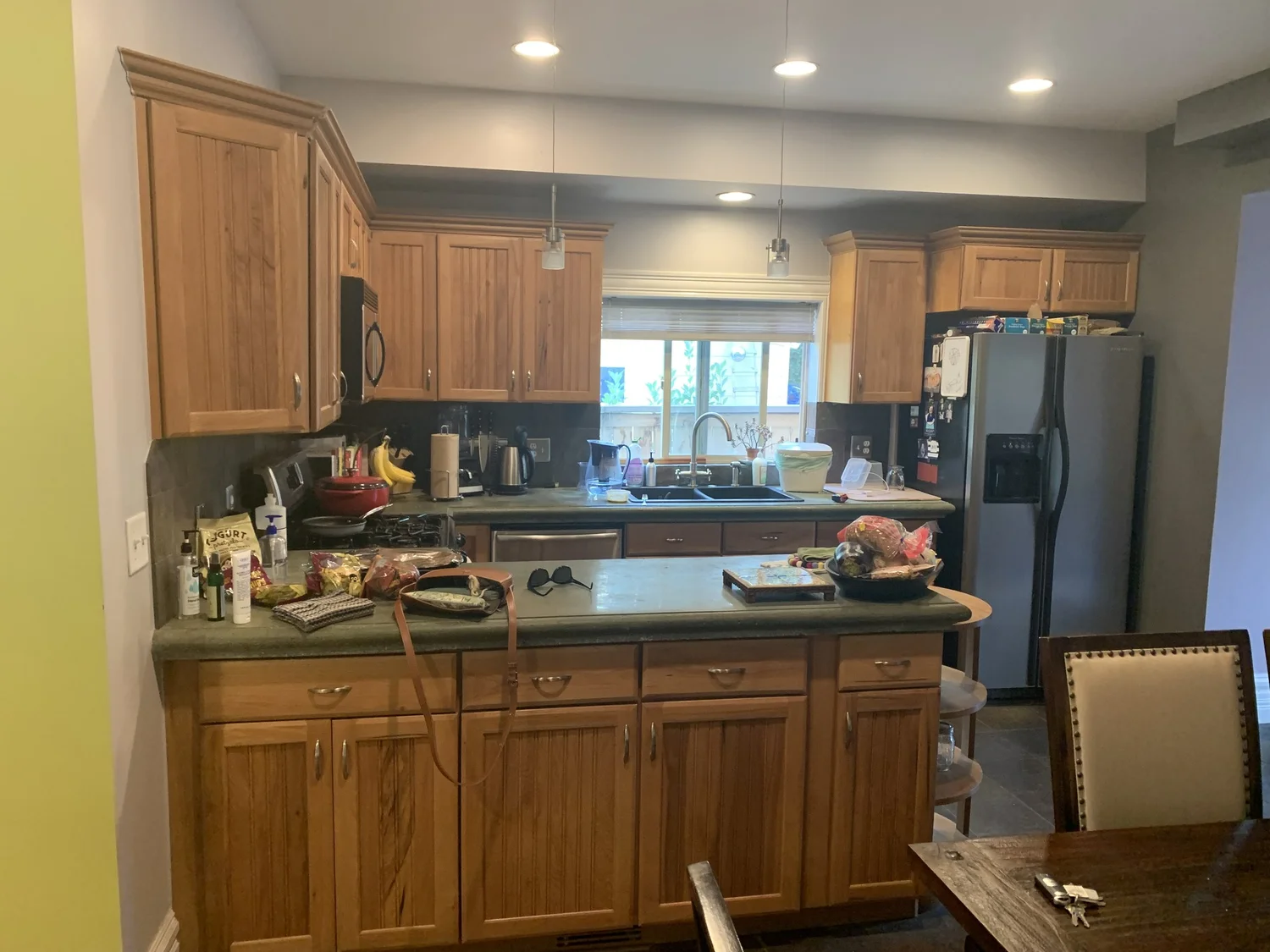
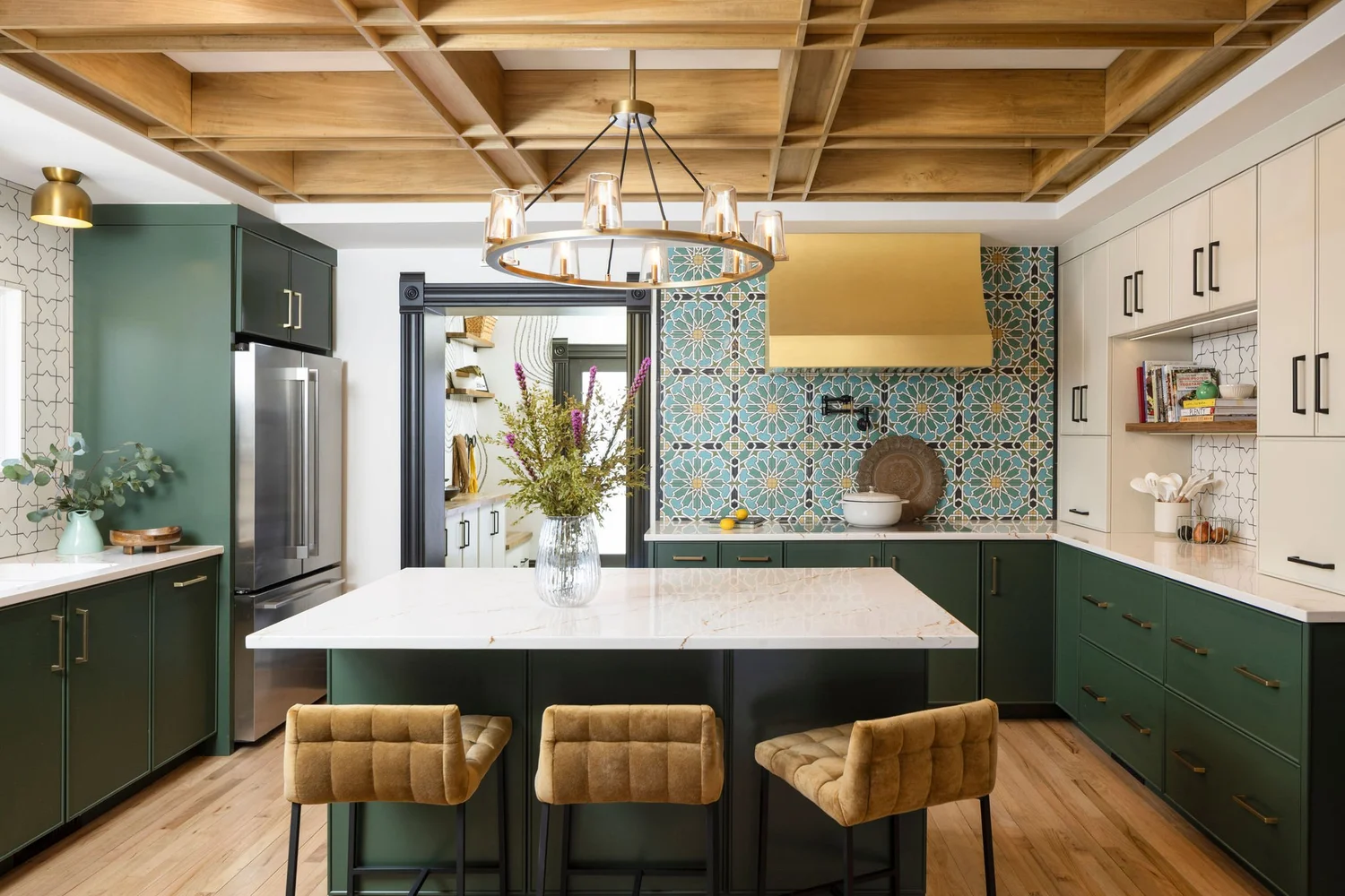
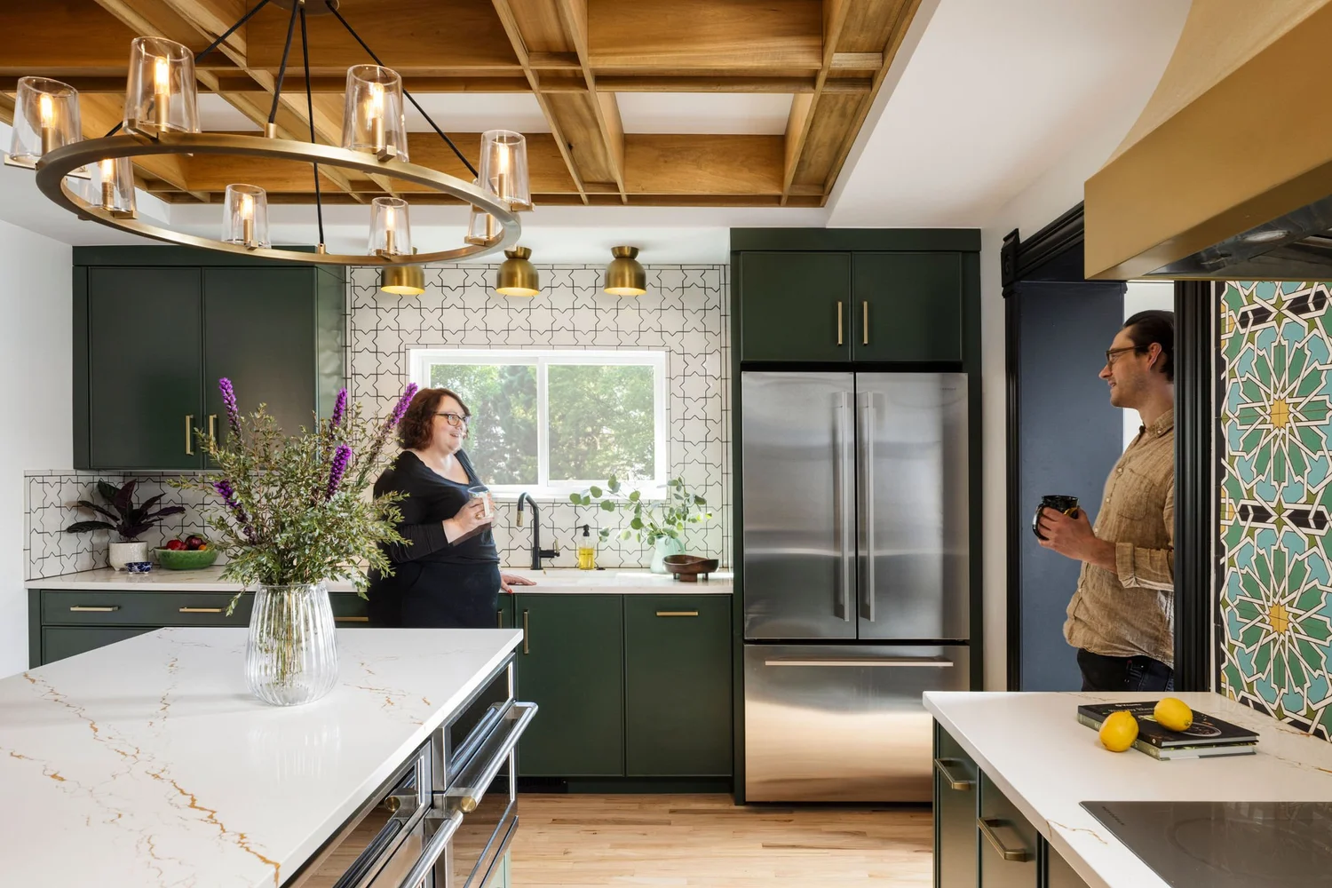
The original kitchen was dark and shared its footprint with the dining room. Separating the two let us expand into the rest of the space and double the size of the kitchen.
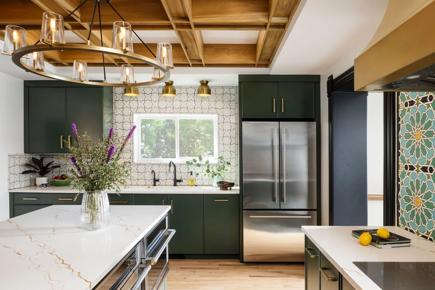
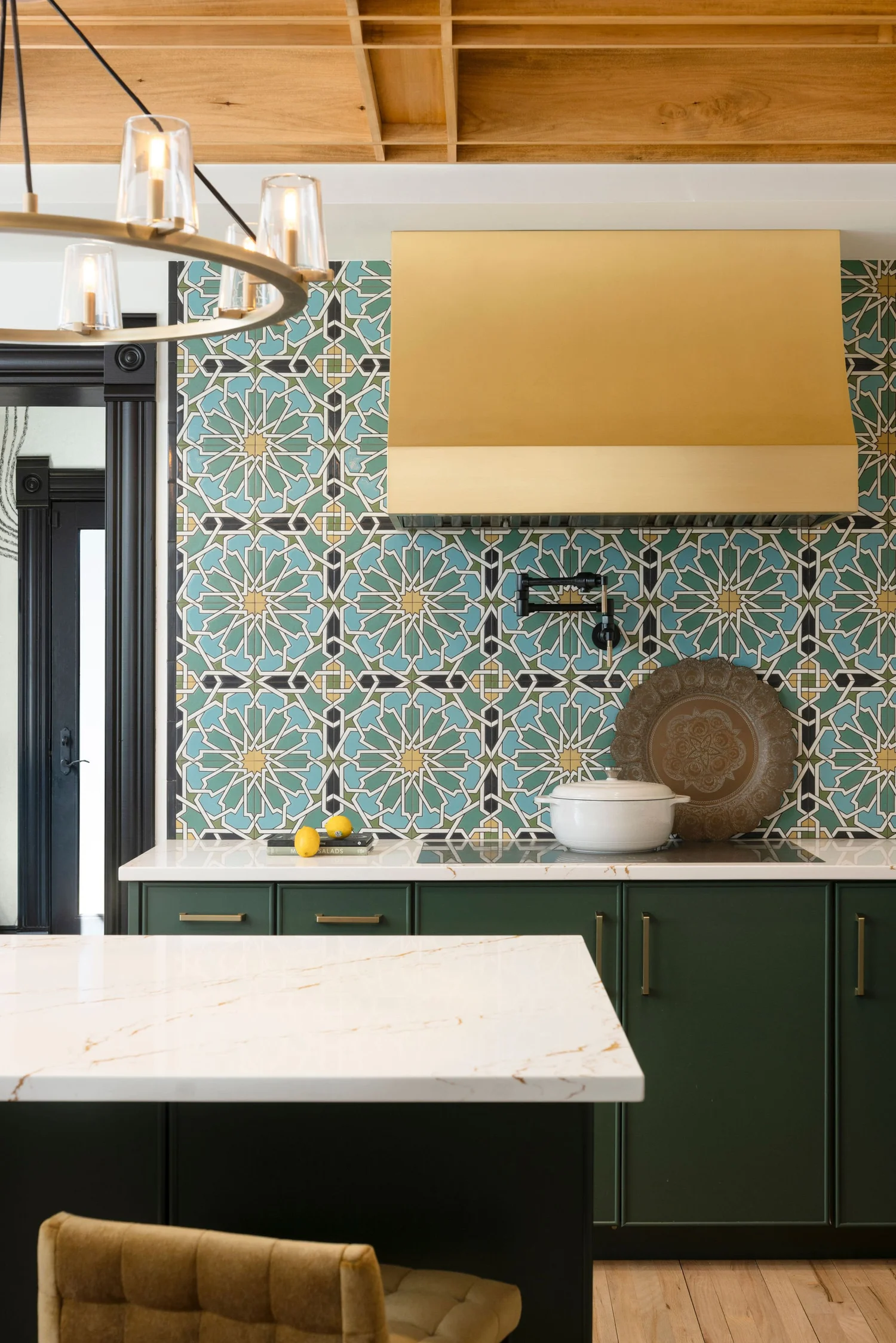
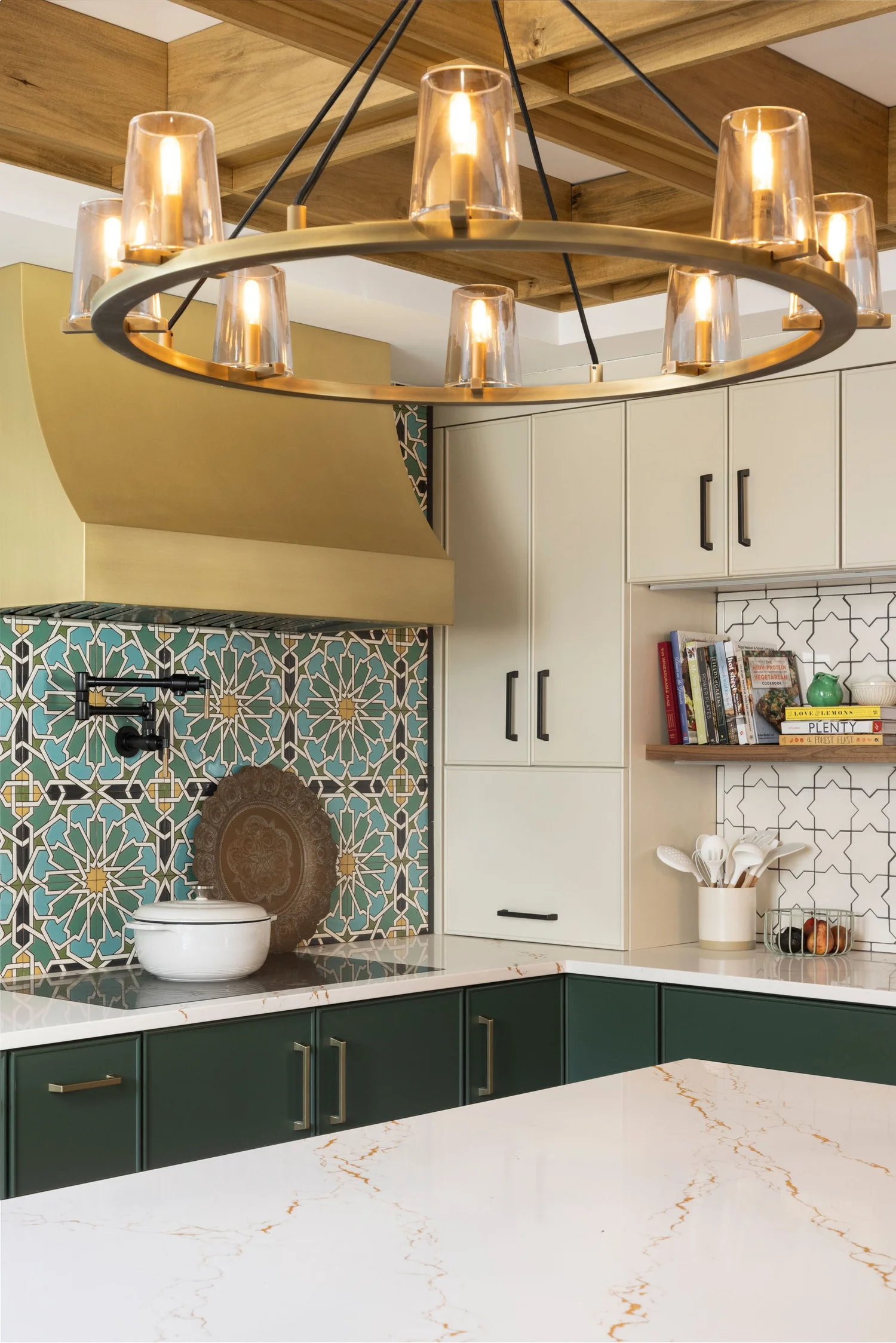
This room sits at the center of the house with three doorways feeding into it, so the plan had to keep household traffic from cutting through the work. Stations solved it. A large island with seating and prep space holds the ovens, an induction cooktop has generous counter on both sides, and the undermount sink gets the same treatment.
Structural beams hide inside one of the drywall soffits and we are not telling you which. Boxing in the ceiling gave us a coffered detail in the middle of the room with wood accents and a dramatic fixture.
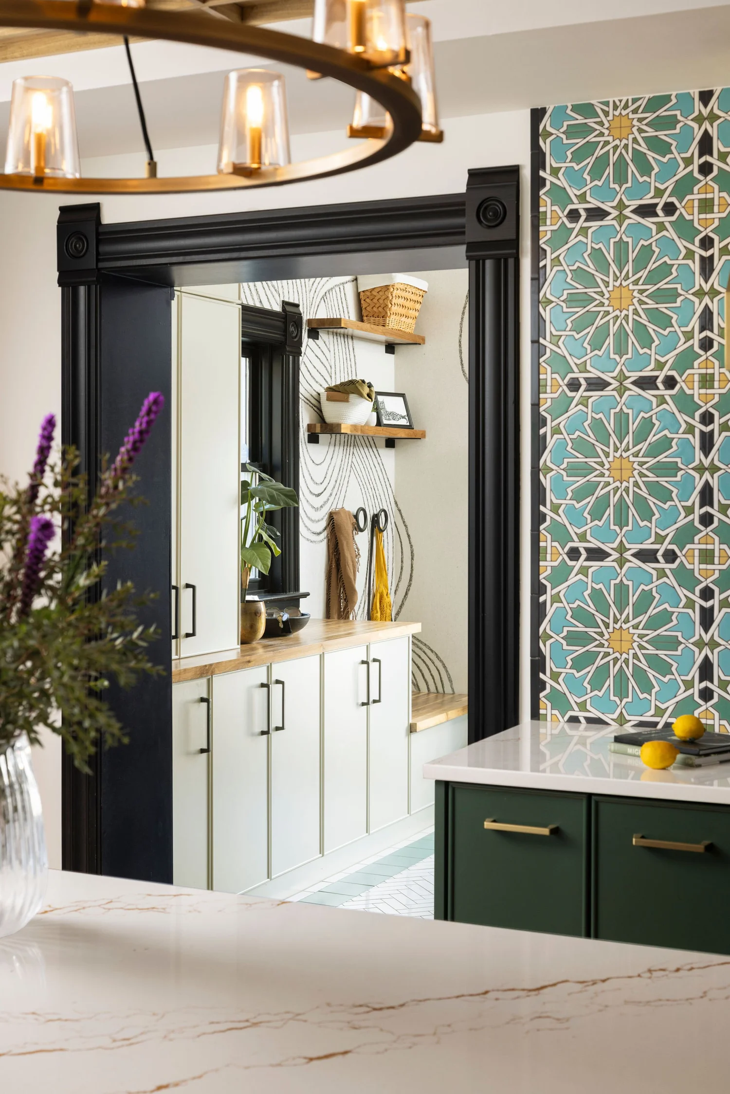
The colorful accent tile on the range wall plays against the brass hood, and simple white star and cross tile through the rest keeps the playfulness going without overpowering the room. Brass on the hood, the hardware, the lighting, and the plumbing picks up the golden veins in the quartz. Cookbook storage was a requirement, so we made it a moment.
The Mudroom
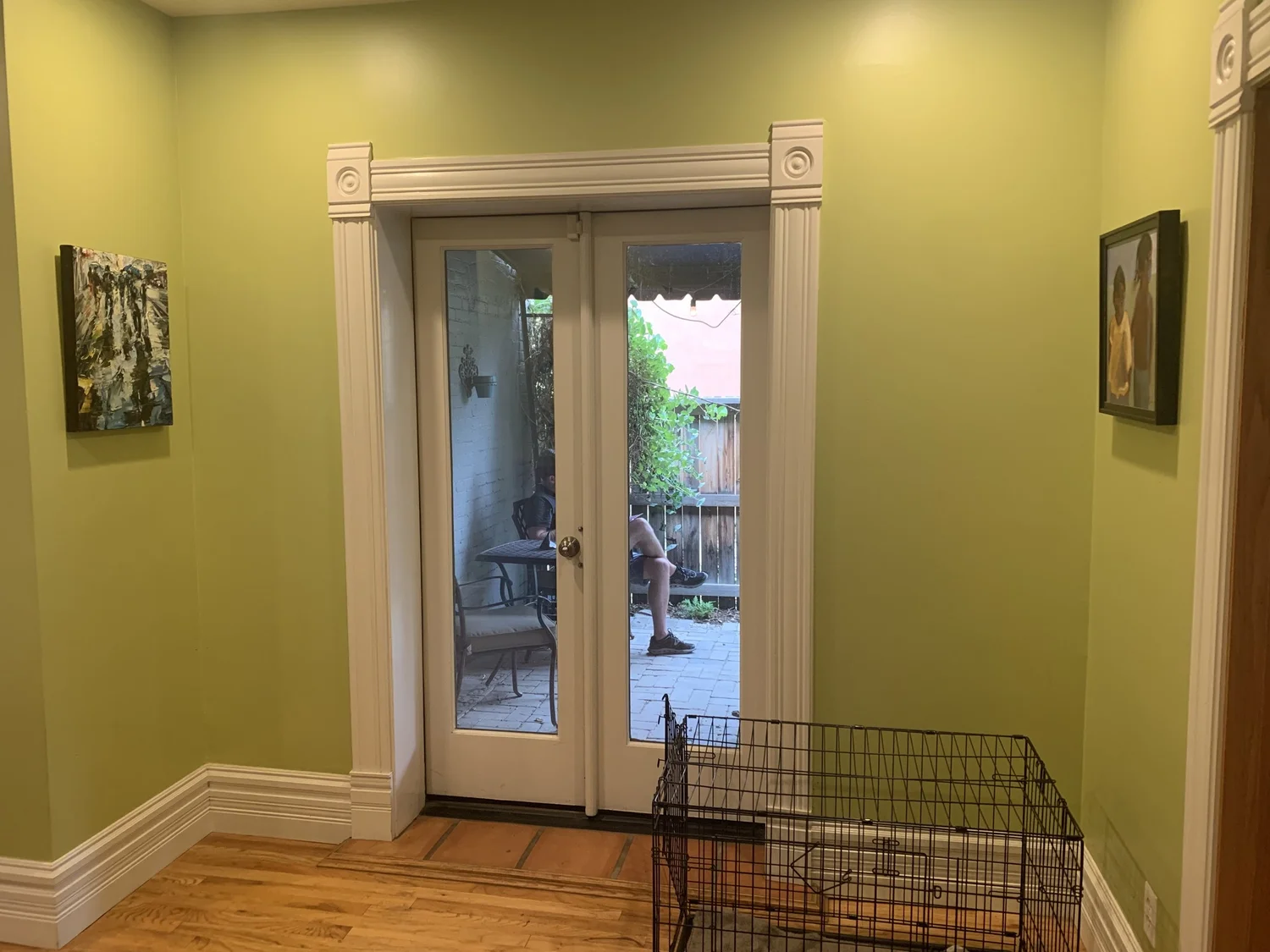
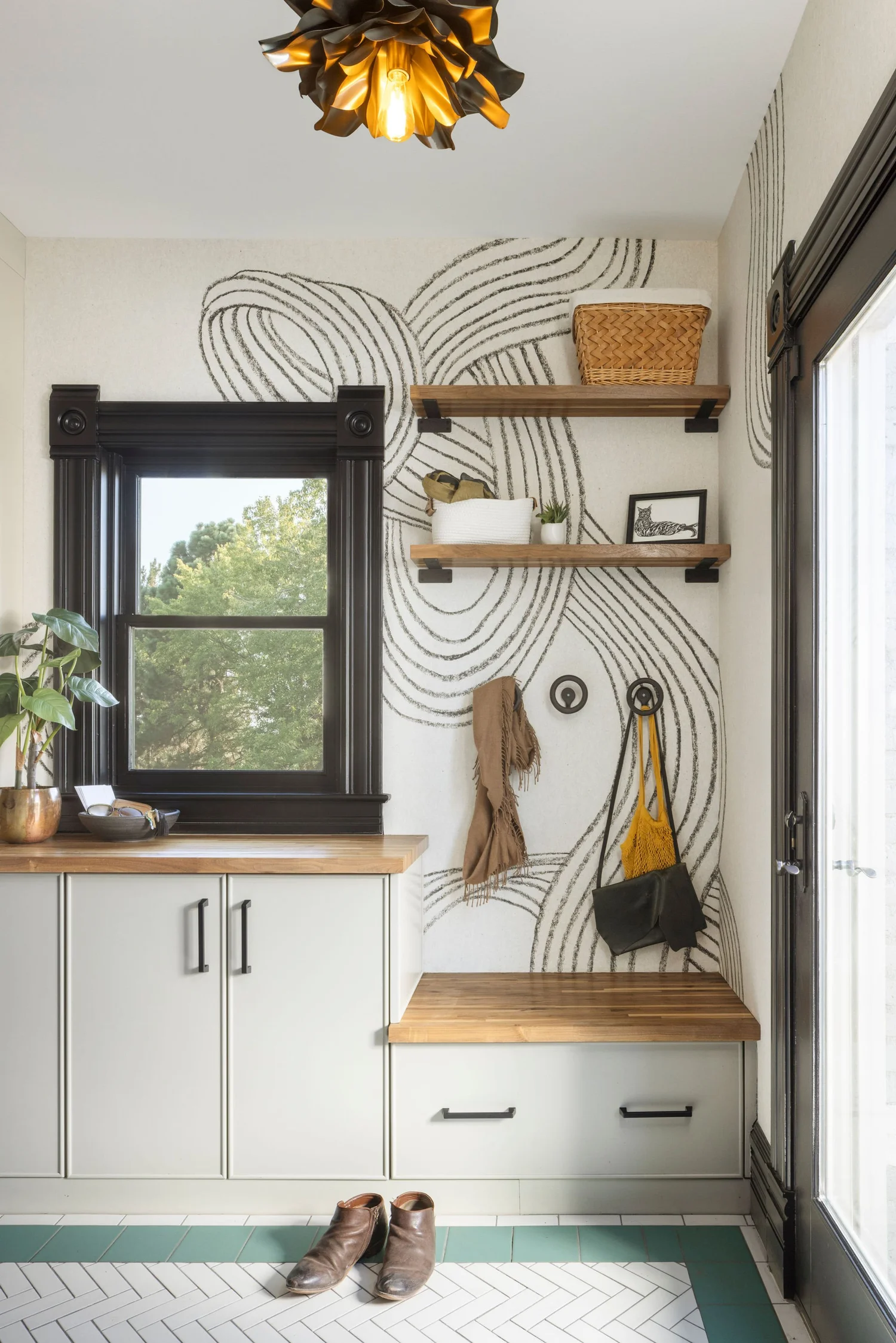
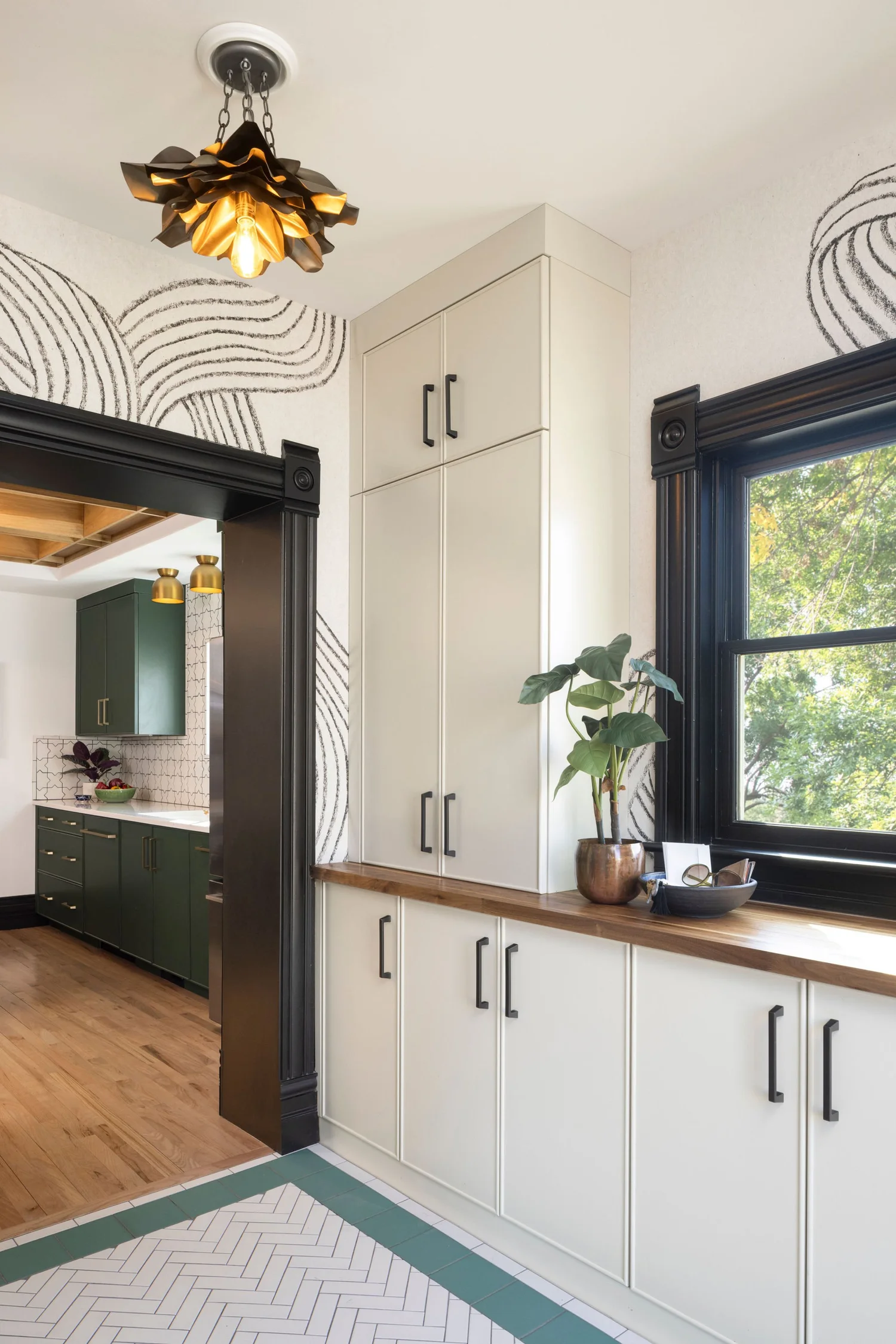
The mudroom sits just off the kitchen and leads to the backyard, which makes it the hardest working room in the house.
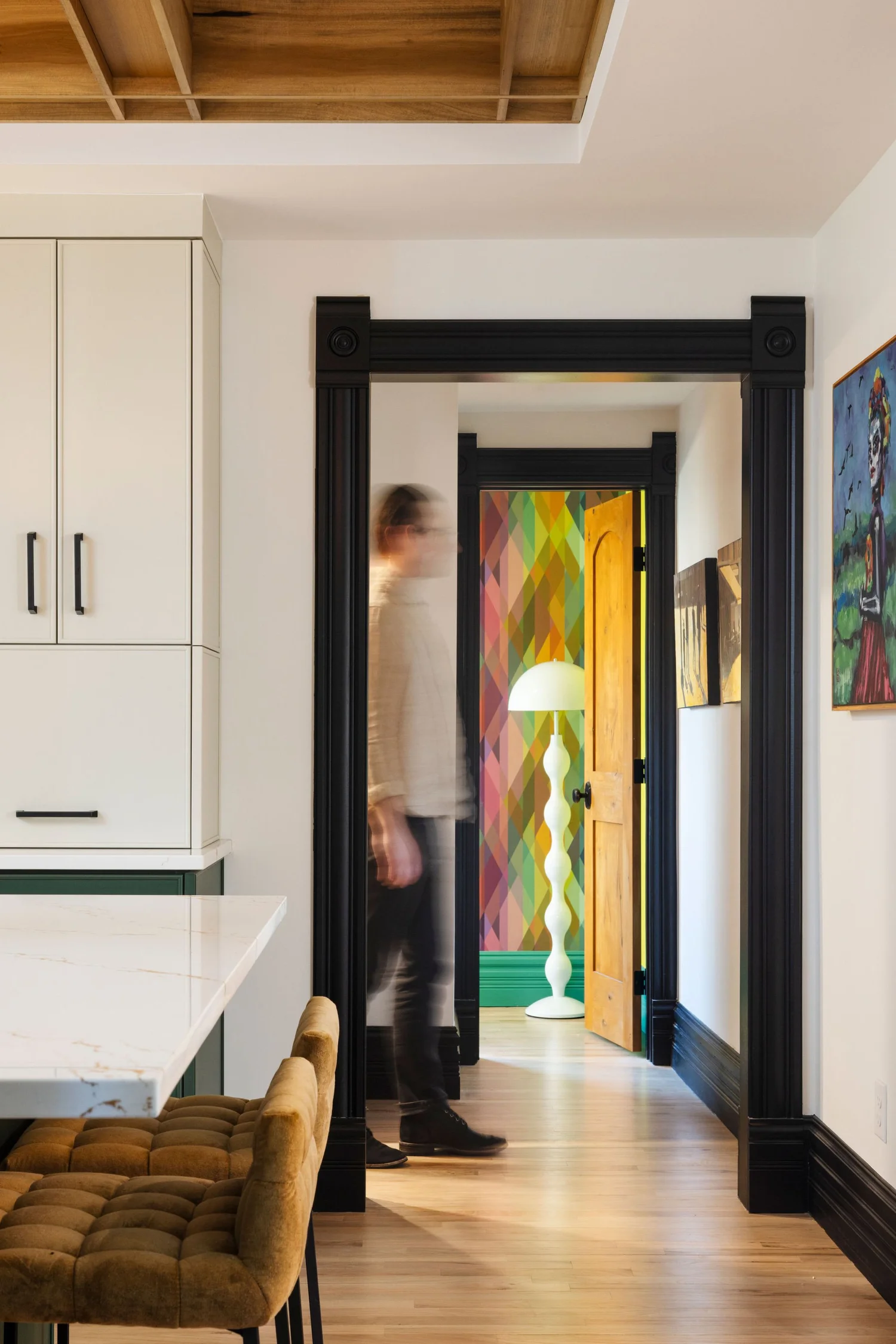
We treated every surface in here. A swirling wallpaper mural, a custom tile floor, and steel flower light fixtures on the ceiling. It is the least colorful room in the house, but the new black casing creates the same contrast moments that run everywhere else, and the border in the floor tile pulls its color straight from the kitchen.
Function drove the rest. A bench with storage, ample hooks for coats and bags, a drop zone for keys and mail, and closed storage for dog supplies, shoes, and whatever the kitchen cannot hold.
Bath One
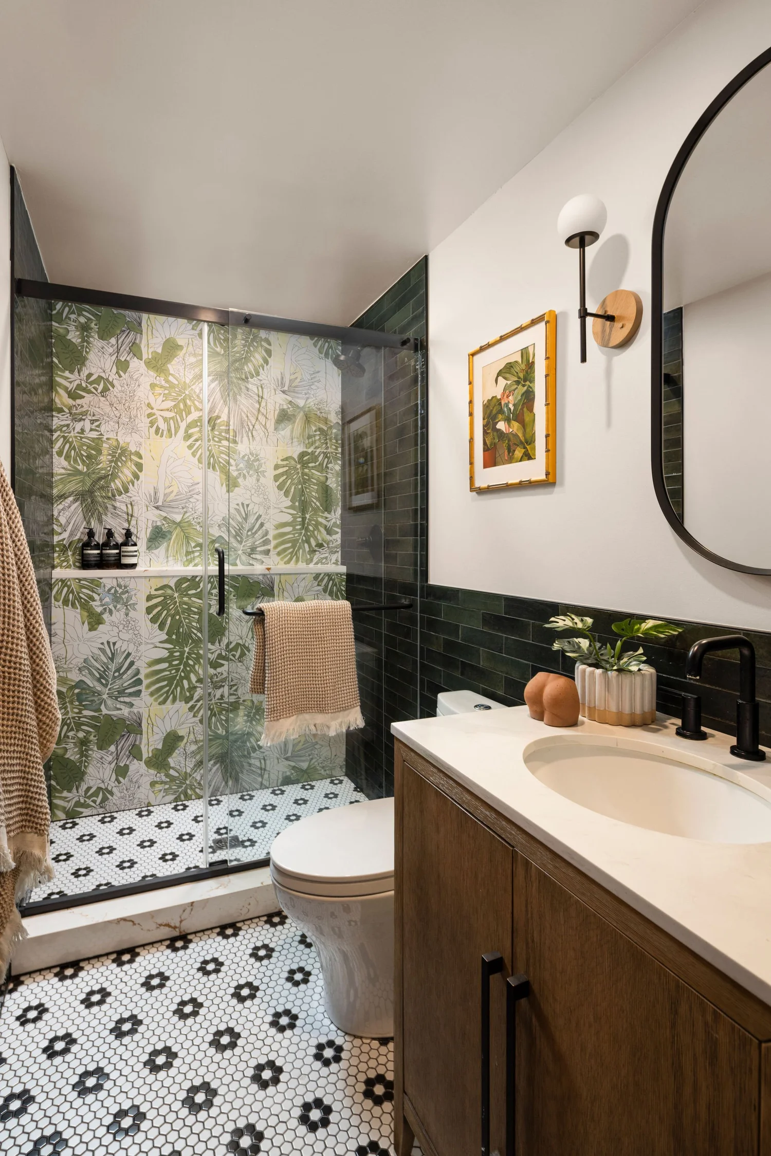
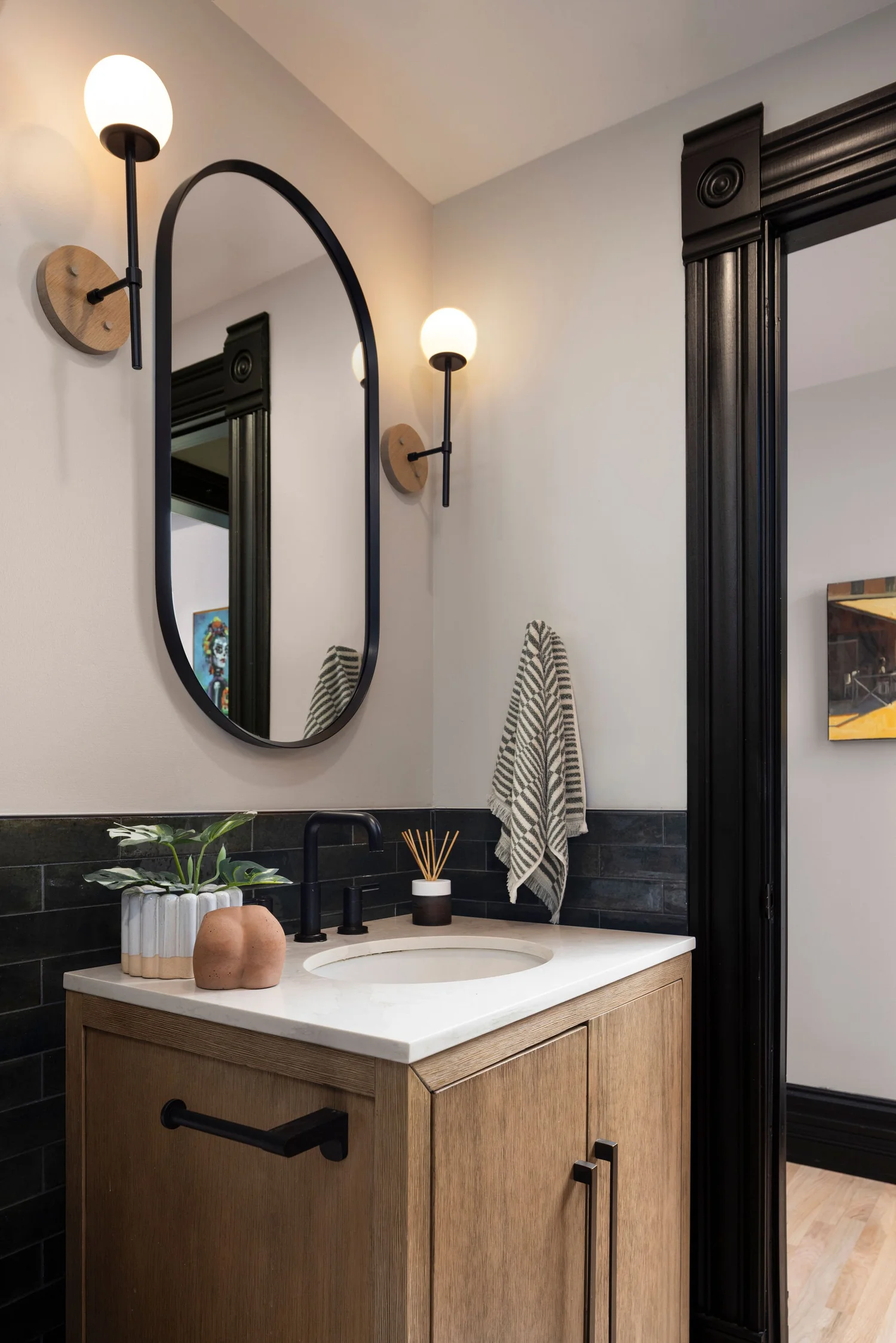
This bathroom replaced the one we pulled out of the dining room, and it now serves the whole main level from a small hall off the kitchen. There is no before for this one, because the room did not exist until we built it.
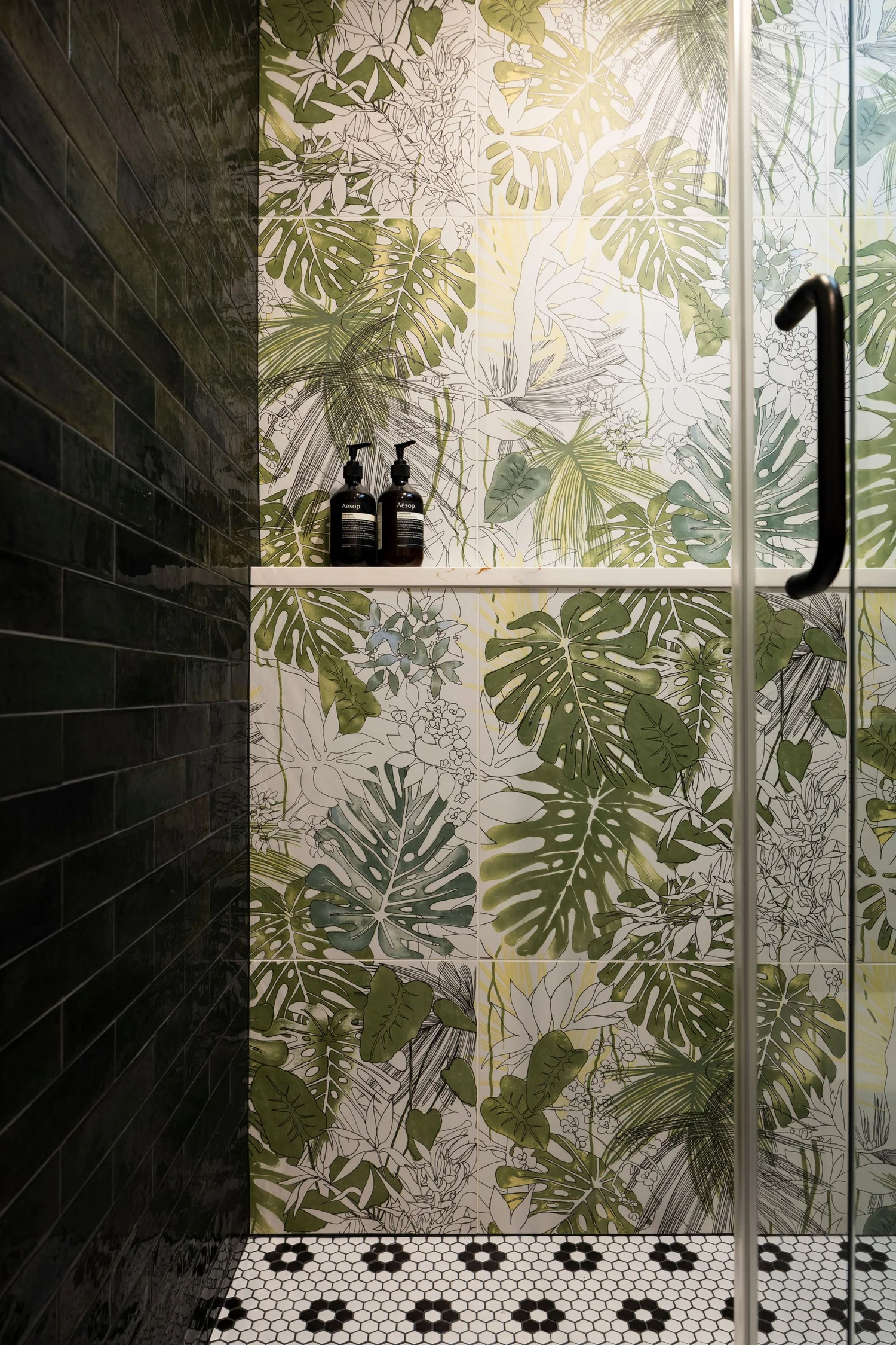
We fell for the jungle leaf mural tile before anything else had been decided and built the rest of the room around it. A large shower with a ledge, a vanity with real storage, and lighting that works for the person actually standing at the mirror.
The deep olive wall tile runs as a wainscot and reads almost black in low light, which keeps the vanity side quiet so the two tiles never compete.
The Guest Bedroom
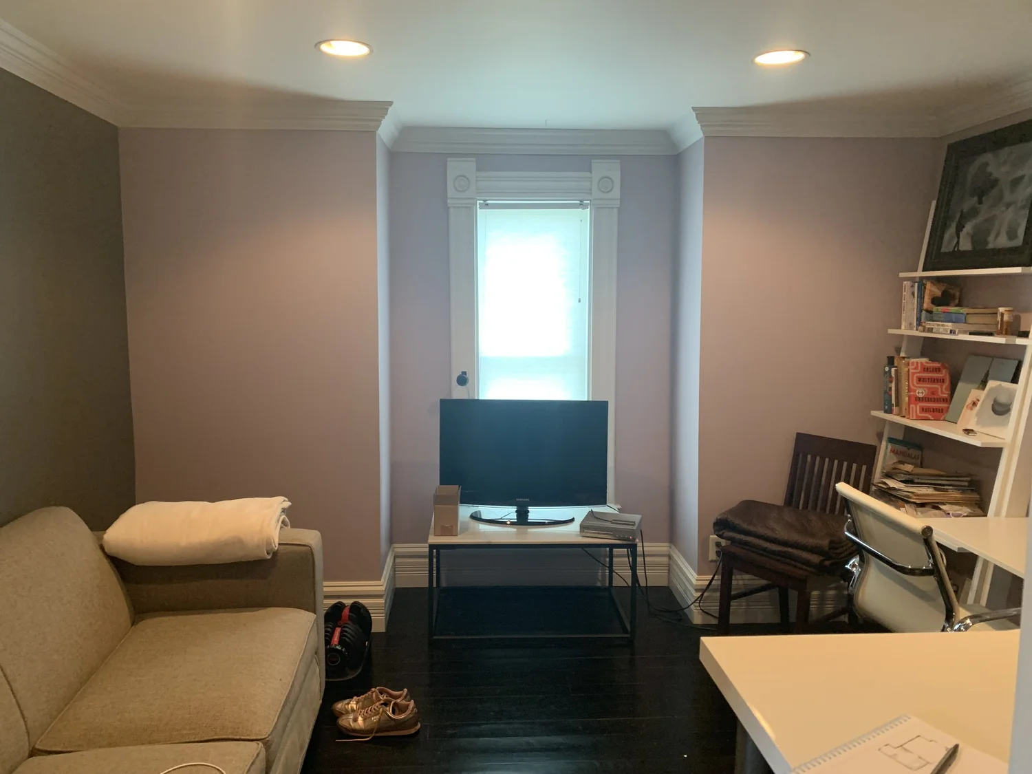
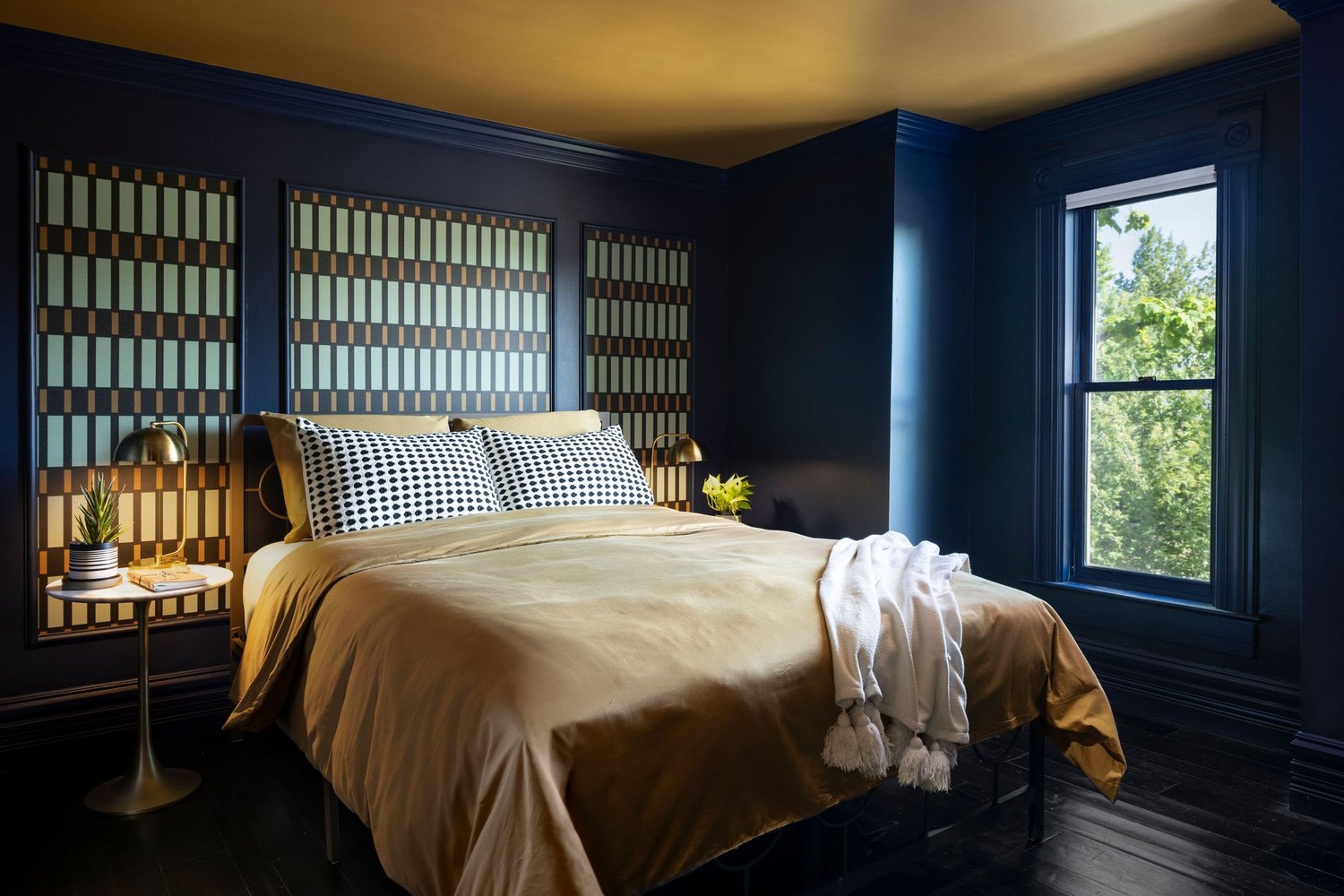
We wanted the house to change its mind upstairs. The main level is bright and busy and full of pattern, so the second floor drops the tone into something quieter and more saturated.
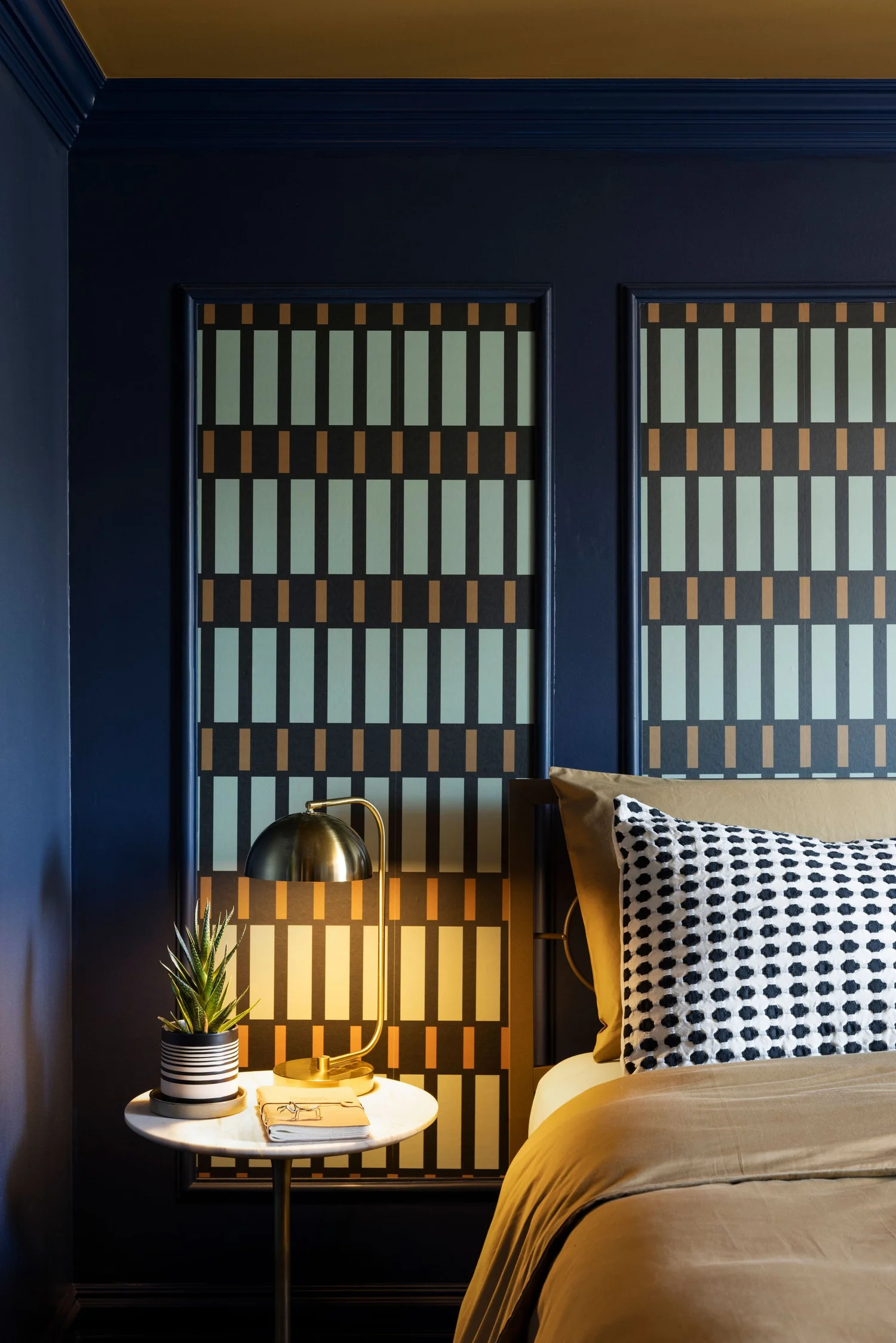
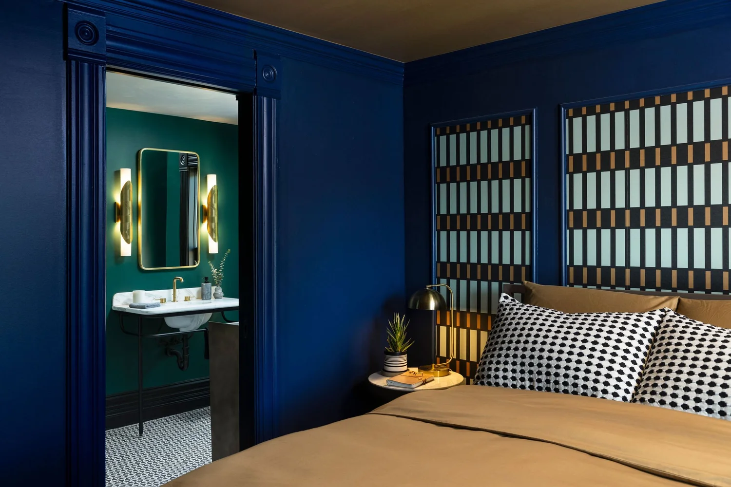
Navy runs across the walls, the trim, the crown, and the casing, which makes the room feel enveloping rather than decorated. The camel ceiling and bedding warm all that cool blue, and without them the room would read cold.
Behind the bed, geometric wallpaper panels sit inside custom trim so they read as framed artwork rather than an accent wall. Pattern still shows up in this room, it just behaves. That black and white geometry repeats through the suite and carries into the bath next door.
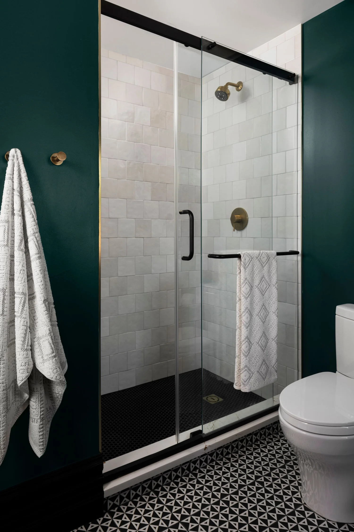
Bath Two
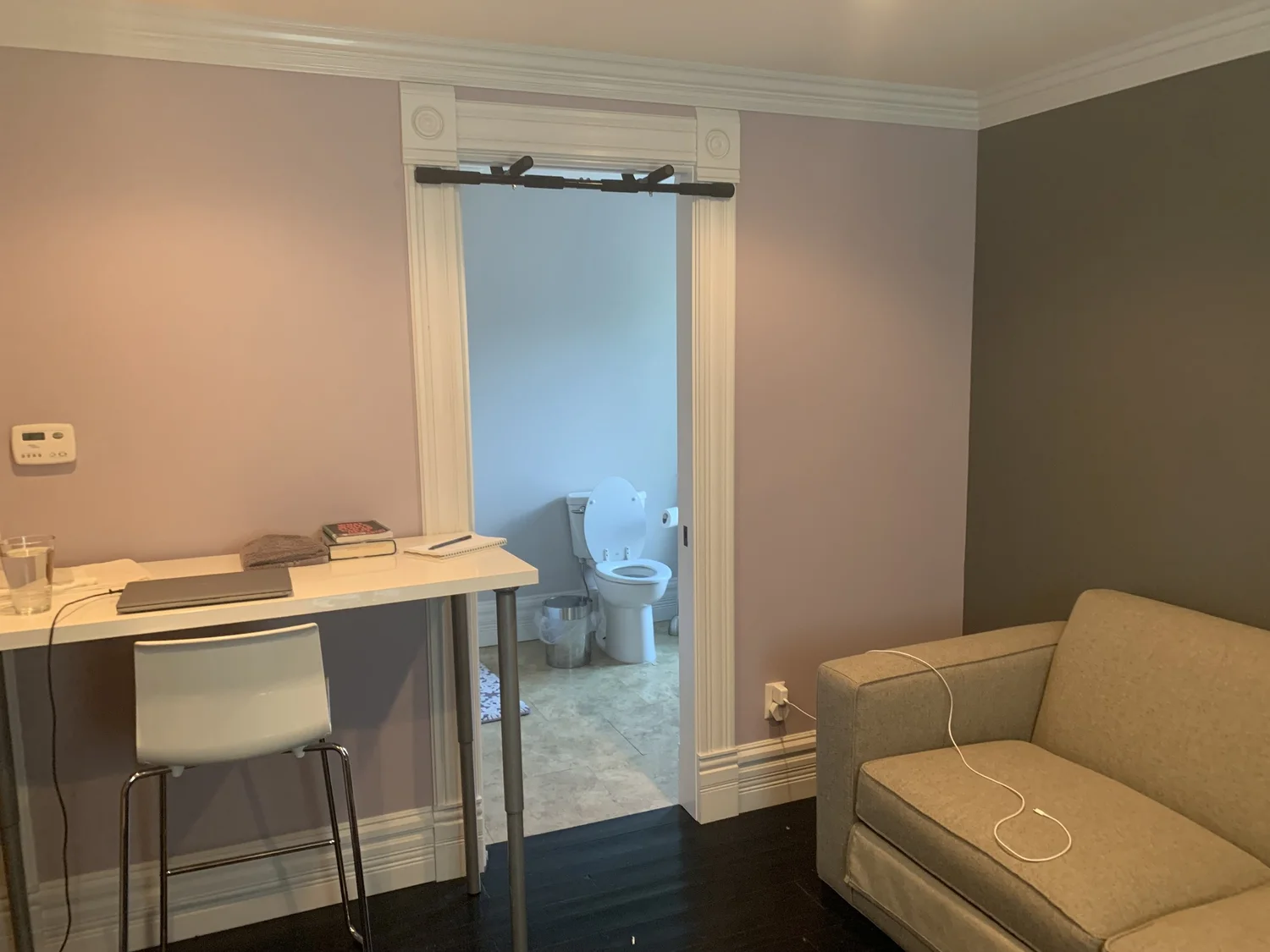
This had been a sad little ensuite with a layout that made no sense. Rather than work around what was already there, we rebuilt the plan from scratch, which is almost always the right call when a bathroom feels wrong and nobody can quite say why.
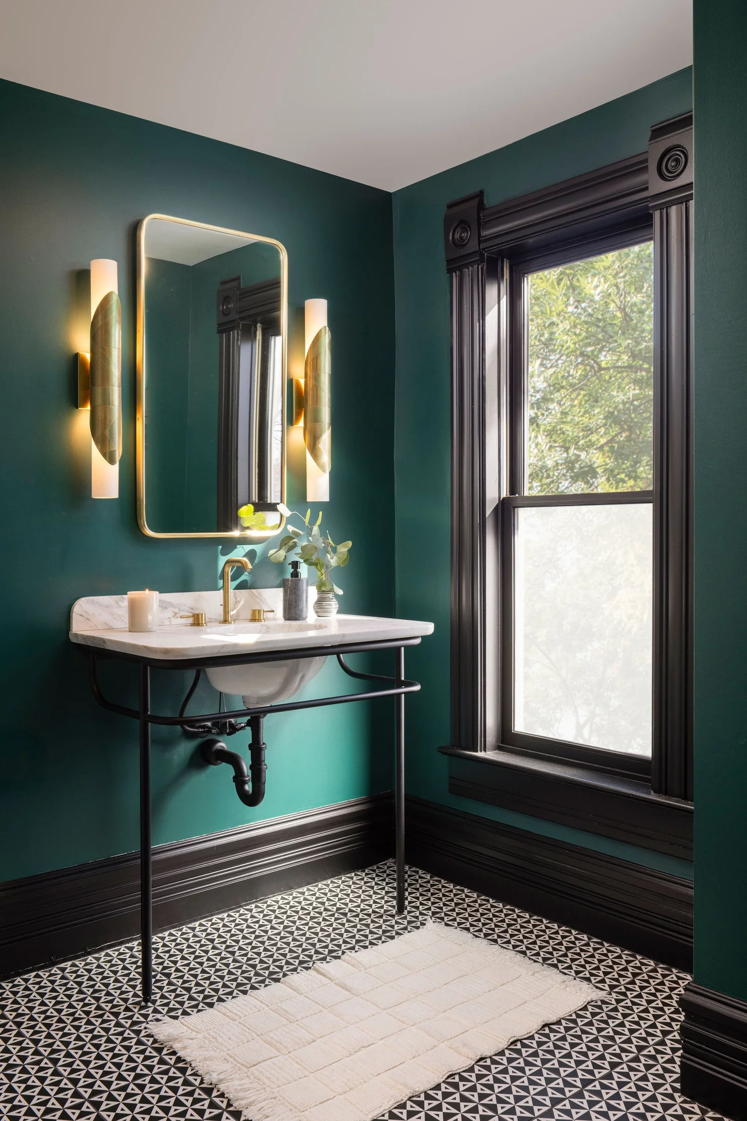
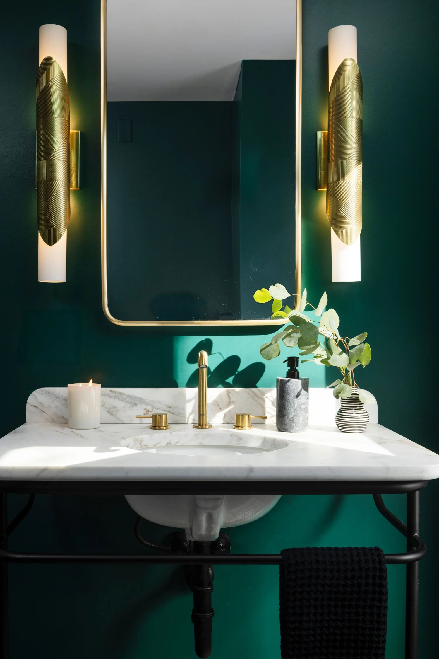
The window is tall and generous for a bathroom this size and became the thing worth building around. Clean lines, real moments of contrast, and mixed metals. Brass faucet, mirror, and sconces set against black metal legs and black casing.
The black and white triangle floor ties back to the geometry in the bedroom next door, so the suite reads as one thought rather than two rooms that happen to share a door. Guests get a bathroom that makes a quiet case for staying an extra night.
The Laundry
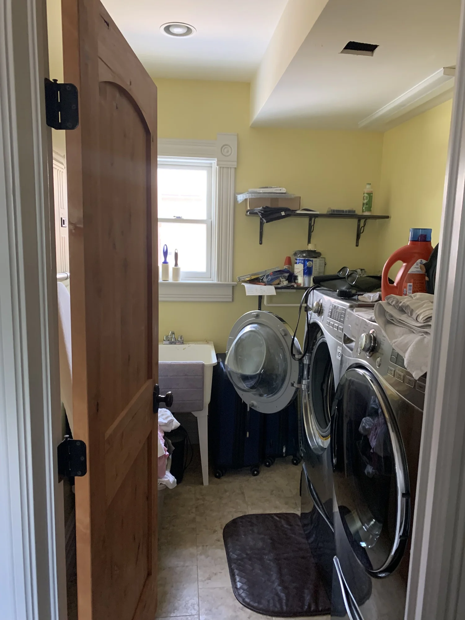
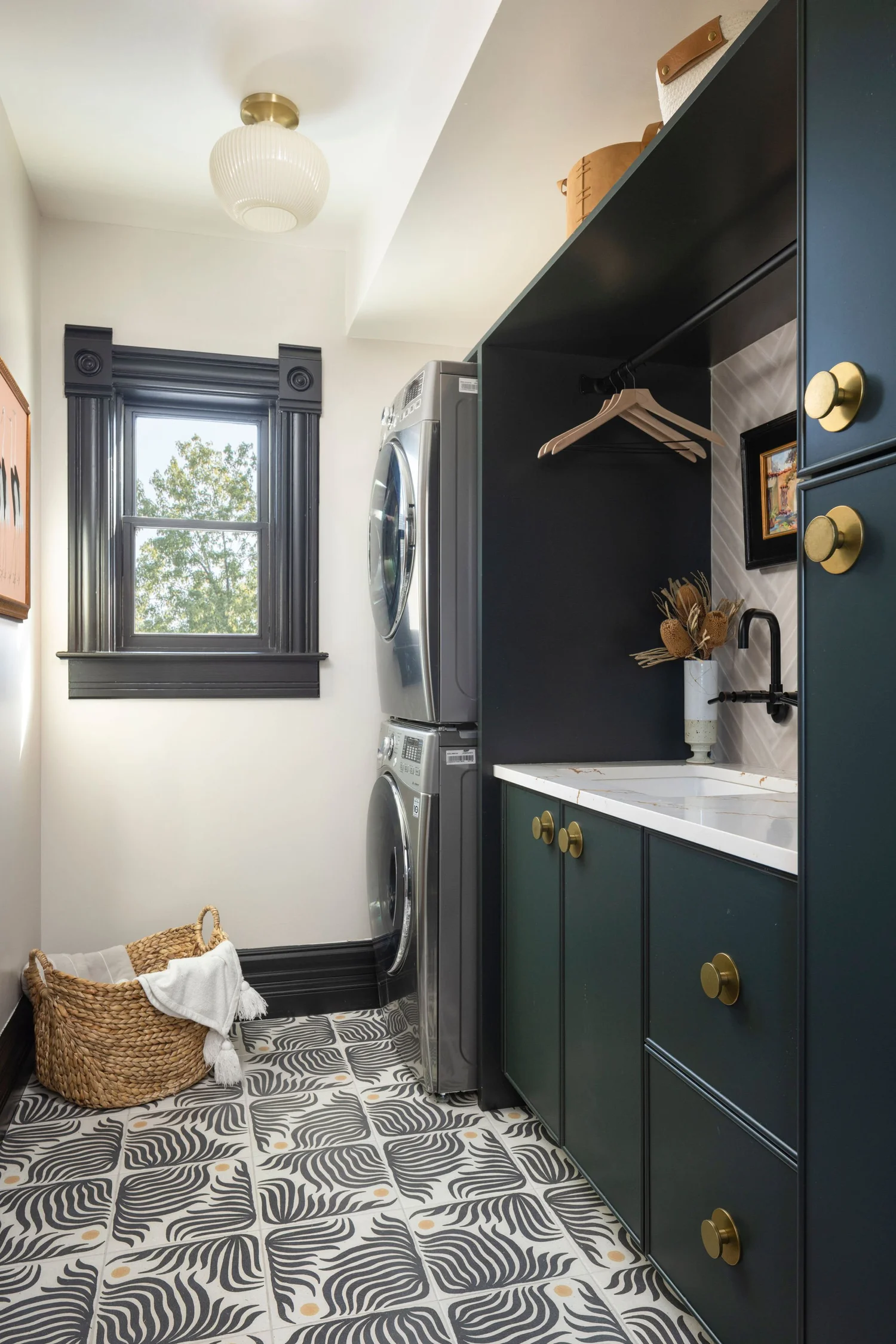
The existing laundry room offered very little in the way of storage, organization, or style, so we changed all three.
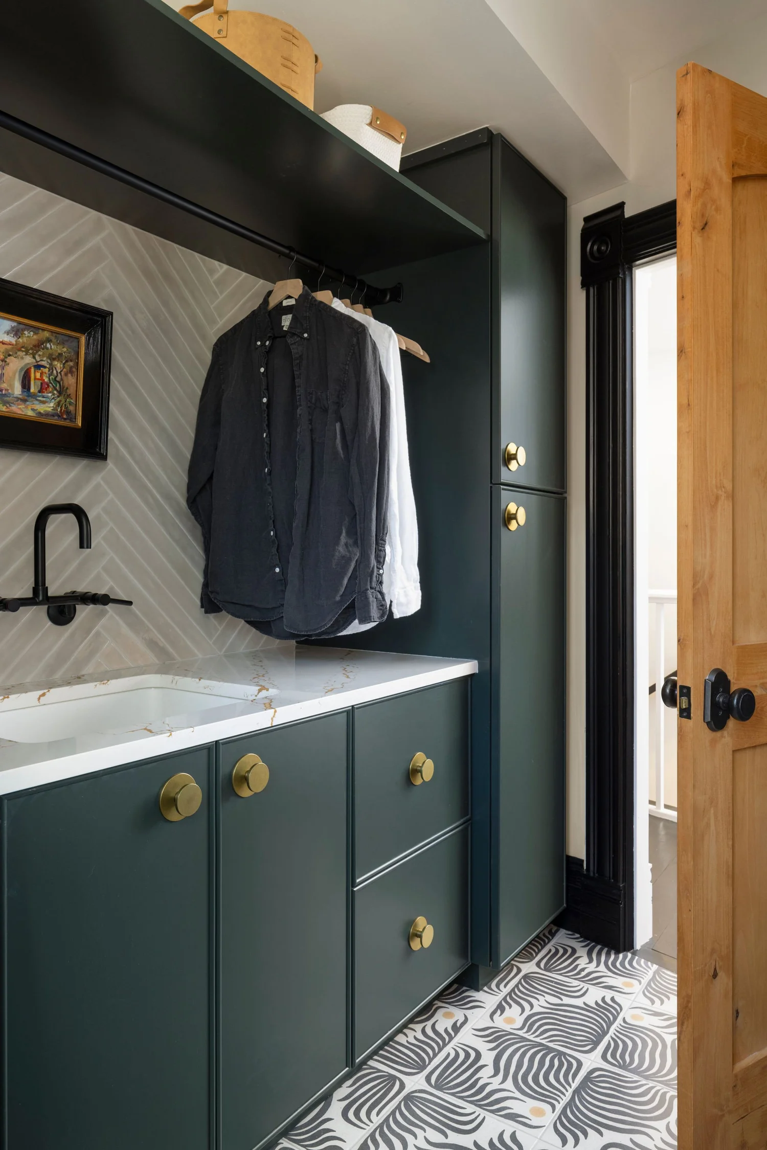
Rich green cabinetry with oversized brass knobs ties to the gold in the counter and the gold circles in the floor tile, which is one of our favorites in the whole house though we would not say that in front of the others.
Added cabinetry and an open shelf handle the storage, a hanging bar takes drying clothes, and new counter space gives laundry somewhere to actually happen. The undermount sink and wall mounted faucet keep cleanup simple.
Who Made It
Surfaces
- Dining WallpaperYork Wallcoverings, Pop Floral Mural
- Mudroom WallpaperRebel Walls, Stripes in Graphite
- Kitchen CountersCambria, Inverness Gold
- Laundry CountersCambria, Inverness Gold
- Paneling + TrimSherwin Williams, Moscow Midnight and Tricorn Black
- Library CabinetrySherwin Williams, Quilt Gold
Tile
- Foyer FloorThe Tile Shop
- Living FireplaceFireclay Tile, 1 x 18
- Kitchen BacksplashFireclay Tile, Star and Cross
- Kitchen Range WallFireclay Tile
- Mudroom FloorFireclay Tile
- Bath One MuralTileBar, Jungle Floral
- Bath One WallGlenrock, Look 2 x 9 in Oliva
- Bath Two FloorTileBar, B2W Angle Negative
- Bath Two ShowerBedrosians, Cloe in White
- Laundry FloorHaus Tile, Palm Life Sol
Cabinetry + Plumbing
- CabinetryTedd Wood
- Cabinet HardwareAtlas Homewares
- Range HoodBloom, Seattle Brass
- Kitchen SinkBlanco, Liven Silgranit
- Bath Two FaucetGrohe
- Bath Two WashstandRejuvenation
- Laundry FaucetKingston Brass
- Laundry Hanging BarSignature Hardware
Lighting + Credits
- Dining ChandelierWorley's, Galileo
- Bath One SconcesWorley's, Persimmon
- Bath Two SconcesPottery Barn, Deane Glass Double Tube
- Laundry LightingWest Elm
- Design + BuildLindy Design Build
- PhotographyJess Blackwell Photography
Have a House With Good Bones?
We handle design and construction together, from the first conversation through the last punch list item. If your home has more potential than it is currently showing, we would like to hear about it.
Start a Conversation